Web & UX Design
Santander Mobility
What happens when one product needs to serve two very different worlds at the same time?
That was the real challenge behind Santander Mobility.
Designing an agreement between people who rarely see the problem from the same side.
On one end, customers managing their car leasing.
On the other, dealers configuring and selling those cars.
Two platforms, two audiences, one ecosystem.
Services:
• Experience Strategy
• Product Design
• Mobile App Design
• Cross-platform Coordination
Industry:
• Financial Services
• Mobility
• Automotive
The team:
• Business stakeholders
• Lead UX
• Senior UX (me)
• Mobile engineering
• Web engineering
• Car dealers
Year:
2022-2023
What is Santander Mobility
Santander Mobility is part of Santander’s broader financial services ecosystem, focused on vehicle leasing and mobility solutions.
The business connects customers, financial products, and dealerships, each with different goals, expectations, and constraints. The digital experience had to reflect that complexity without exposing it.
Project overview
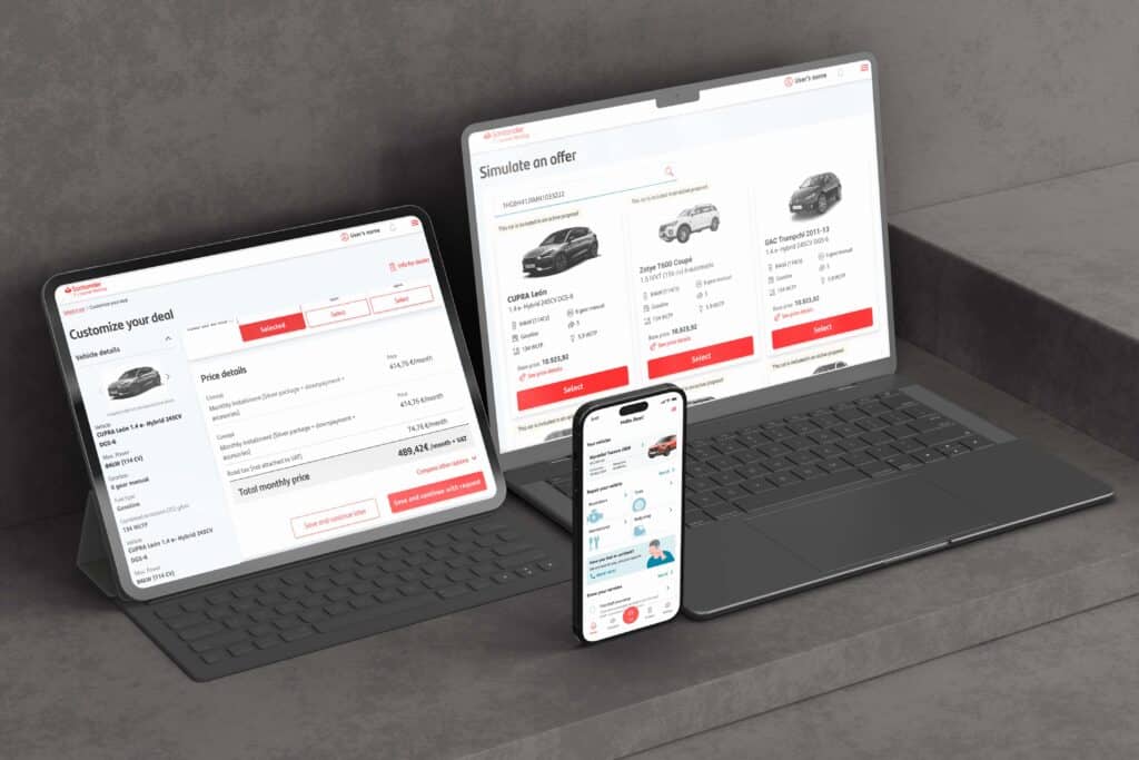
The project covered two products running in parallel.
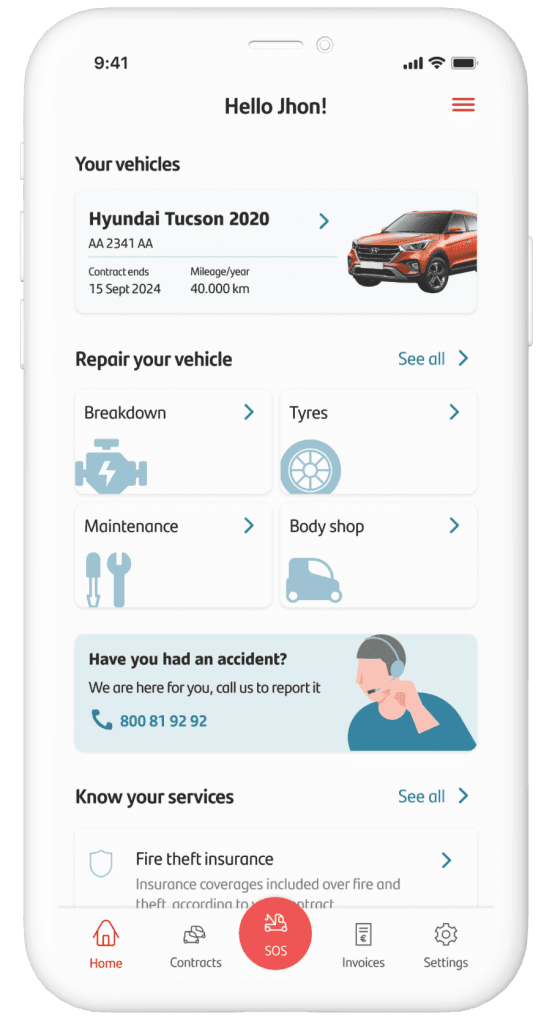
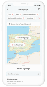
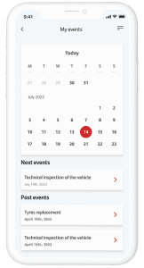
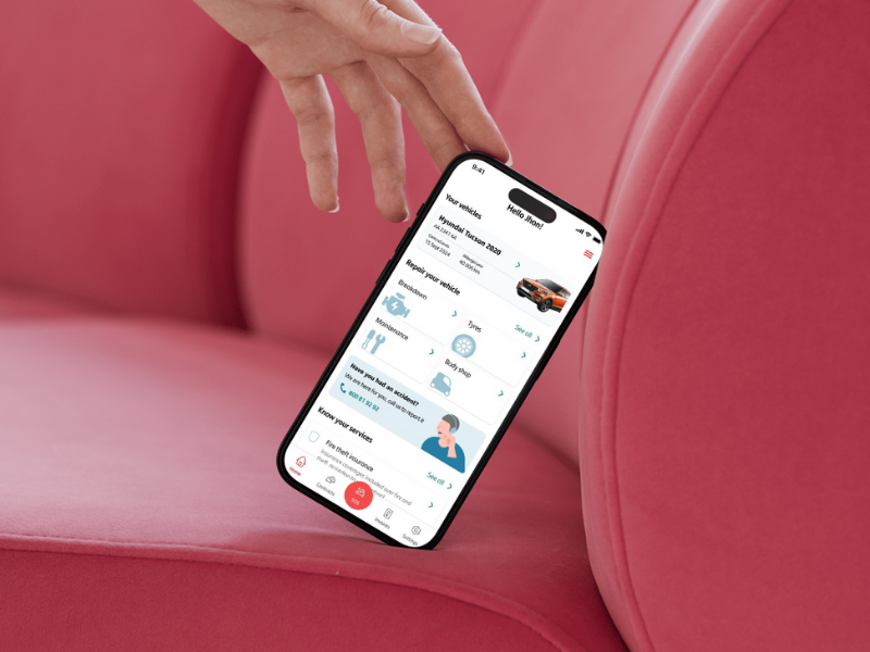
A mobile app, used by customers to manage their car leasing.
And a desktop web platform, used by car dealers to configure vehicles and prepare offers for those same customers.
Both products depended on each other.
If one failed, the whole experience suffered.
I joined the project as a Senior UX Designer, working alongside a Lead UX. As the scope grew, it became clear that both platforms required full focus. I took ownership of the mobile experience, while the Lead UX focused on the web platform.
Scope of work
The work went far beyond interface decisions.
Each sprint introduced new constraints: regulatory requirements, business priorities, dealer workflows, and technical dependencies across teams. The mobile experience had to remain simple and reassuring for customers, while still reflecting decisions made earlier on the dealer side.
Regular workshops and sprint reviews helped align the different teams. Large presentations followed each sprint, ensuring that progress, trade-offs, and risks were clearly communicated to stakeholders.
My role gradually shifted from execution to coordination, making sure the mobile experience stayed coherent while multiple decisions were being made around it.
Final result
The result was a mobile app that allowed customers to manage their leasing in a clear and structured way, alongside a desktop platform that supported dealers in configuring vehicles and preparing offers.
Together, the two products formed a connected flow rather than separate tools. Customers could understand their leasing status without friction, while dealers could work efficiently without having to adapt to consumer-focused interfaces.
The project involved multiple teams and hundreds of users, both internal and external. Adoption and engagement on the mobile side showed that customers were able to navigate the product with confidence, even as business logic remained complex behind the scenes.
The success of the work wasn’t in simplicity alone, it was in alignment.
Key takeaways
Scale doesn’t come from features.
It comes from decisions.
This project was a reminder that leadership in design often means choosing what not to push forward, especially when many voices are involved. Keeping two platforms aligned, two audiences satisfied, and multiple teams moving in the same direction required clarity more than creativity.
And in large organizations, clarity is the hardest thing to design.