Web & UX Design
NutriGuide
What if improving the way you eat feels like a game?
That question quietly shaped NutriGuide from the beginning.
The idea was to help people understand their choices well enough that healthy living felt less like a chore and more like a pattern people could stick with.
This project was both design and partnership, a private collaboration with stakeholders, product leads, and engineers, all invested in making nutrition feel approachable.
Services:
• Product Design
• Experience Direction
• Interface Design
• Collaborative Iteration
Industry:
• Health Tech
• Wellness
• Personal Behavior
The team:
• Product stakeholders
• Engineering
• UX design (me)
• Nutrition insights contributors
Year:
2024
What is NutriGuide
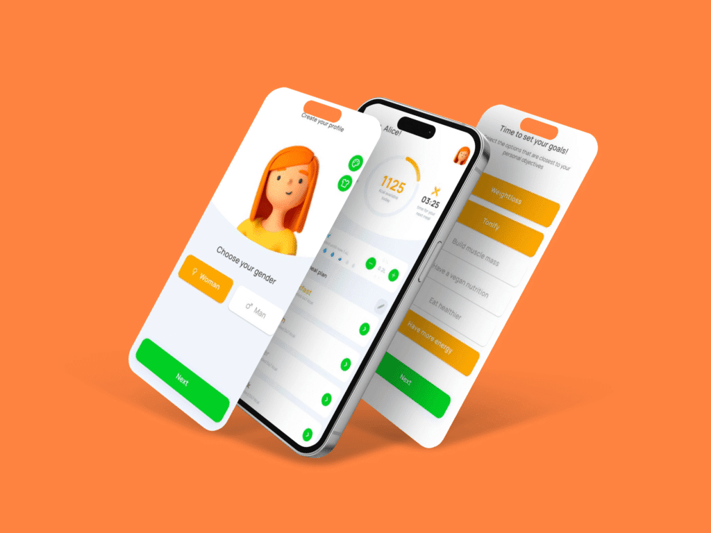
NutriGuide is a personalized nutrition platform that helps users navigate eating choices without overwhelming them with rigid rules. It blends user preferences, goals, and simple guidance into a space that doesn’t feel clinical or confusing.
The audience was broad: people curious about eating better but not interested in fad diets or complicated tracking — just clarity and support they could live with.
Project overview
The product began with a clear intent and a practical constraint: it had to be useful every day, not just when motivation was high.
We started by asking something simple: what do people struggle with most when they think about healthy eating? The answers were rarely about food. They were about uncertainty, time, and confidence. That insight became a compass for design decisions.
Stakeholders had strong domain knowledge, and the engineering team knew what could be done. My role was to bridge that with people’s lived experience — understanding how someone behaves when they open an app at 8AM or after a long day.
Scope of work
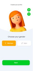
The work focused on reducing cognitive load.
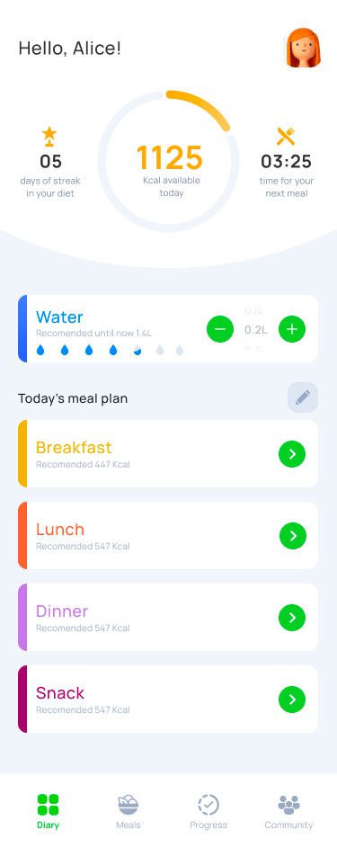
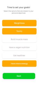
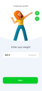
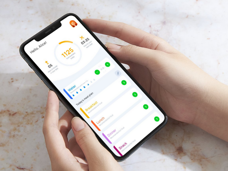
Menus, meal ideas, preferences, schedules, and habits were organized so users wouldn’t have to think too much about how to start or what to choose — just enough to feel in control.
We tested features early with small samples of users, gathered feedback, and adjusted. Pages were structured with intent rather than decoration. Choices were simplified without stripping away meaning. And every screen was treated as a step toward clarity, not another form to fill.
Design and engineering worked in cycles, shaping the interface to match real use — not a theoretical ideal.
Final result
The launched platform became a quiet companion for users trying to make healthier choices.
Over time, tracking showed that people returned regularly — not because they were being reminded, but because they used it in the moments they actually stood in front of food decisions. Retention was meaningful: people who tried it came back, often exploring features they hadn’t expected to use.
Engagement grew steadily in the weeks after rollout, and feedback highlighted that people appreciated how straightforward it felt. There were measurable improvements in daily active use compared to the first version, and support inquiries dropped as users began understanding flows without needing help.
NutriGuide didn’t transform eating overnight.
It helped people approach food with more confidence — and do so with less friction.
Key takeaways
Tools that help with personal habits shouldn’t feel like a checklist people owe.
They should feel like a quiet partner, present when needed and fading into the background when not.
This project reminded me that design is less about adding features and more about understanding when people give their attention. If you respect that moment, the interface becomes a support — not a barrier.