Santander Mobility: Revolutionizing Car Leasing Through UX and CX
How I led the redesign of Santander’s car leasing platform, blending UX design and customer experience (CX) strategy to deliver a platform that reduced leasing time by 30% and increased digital adoption by 50%
The Vision: Putting Customers in the Driver’s Seat
When I joined Santander Consumer Finance, the car leasing process was a headache for customers. Endless paperwork, phone calls, and delays left users frustrated and disengaged.
I had to reimagine the entire leasing journey, creating a digital-first experience that would make leasing a car as smooth as a test drive.
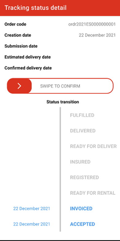
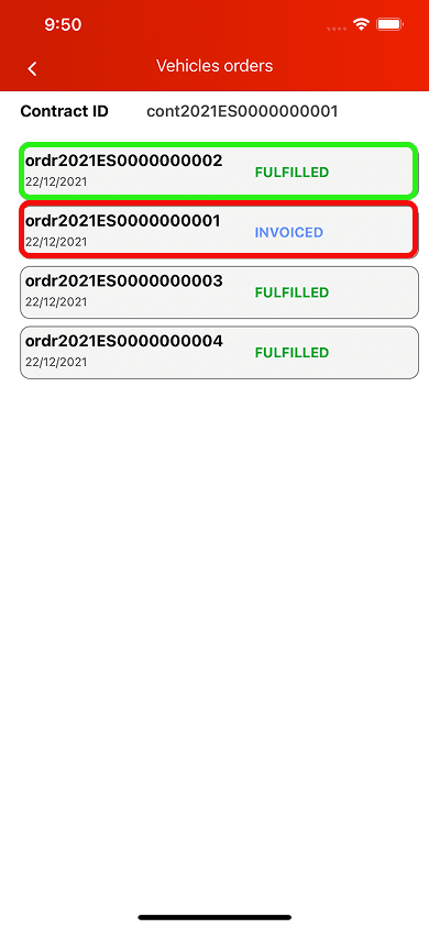
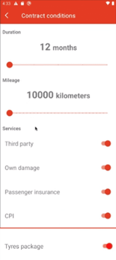
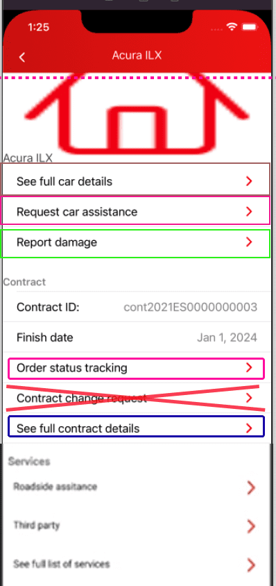
Original sketches
The Problem: A Broken Leasing Experience
Leasing a car should be an exciting experience—getting a brand-new vehicle that opens the door to new adventures and makes everyday life easier.
But Santander’s process was stuck in the past—decentralized, manual, and reliant on phone support. Customers had to navigate a maze of paperwork, while internal teams struggled with inefficient workflows.
The challenge was clear: design a platform that would delight customers and empower employees, all while driving digital transformation.
The Users: Designing for People, Not Processes
To create a truly customer-centric solution, we focused on two key groups:
Leasing Customers: People who wanted a fast, transparent, and hassle-free way to lease cars.
Santander Employees: Internal teams who needed better tools to serve customers efficiently.
By understanding both perspectives, we designed a platform that not only met user needs but also enhanced the overall customer experience.
The Approach: Adapting to Constraints with Design Thinking
As the Senior UX Designer, I took on a dual role, blending UX design with customer experience (CX) strategy. However, unlike smaller, agile projects, Santander’s size and market position required a more structured approach. Lean UX, with its focus on rapid iteration and continuous testing, wasn’t feasible here. Instead, I relied on a traditional Design Thinking framework, ensuring every decision was well-researched, validated, and aligned with business goals before implementation.
Here’s how I balanced both roles within these constraints:
Empathize & Define:
Conducted in-depth workshops with stakeholders to align on business goals and customer pain points.
Interviewed real customers to map their frustrations, needs, and expectations.
Defined clear success metrics, such as reducing leasing time and increasing digital adoption.
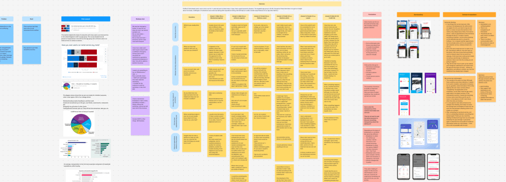
A glimpse into my annotation board
- Ideate & Prototype:
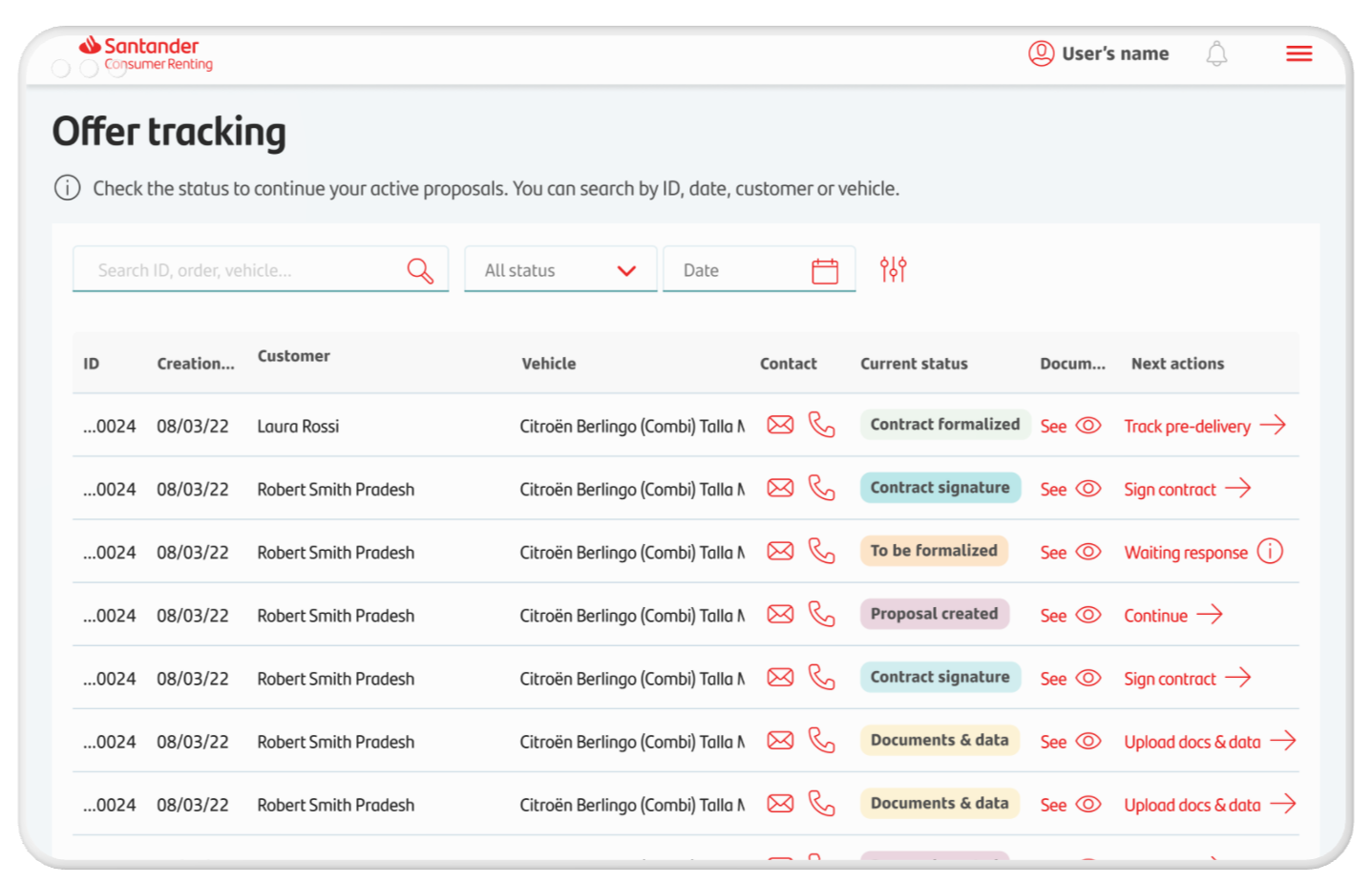
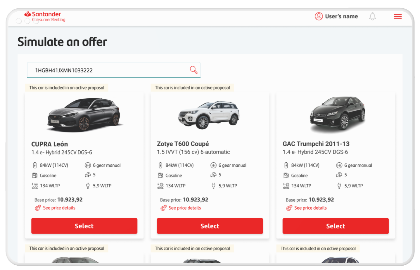
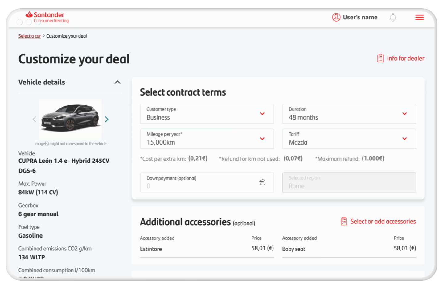
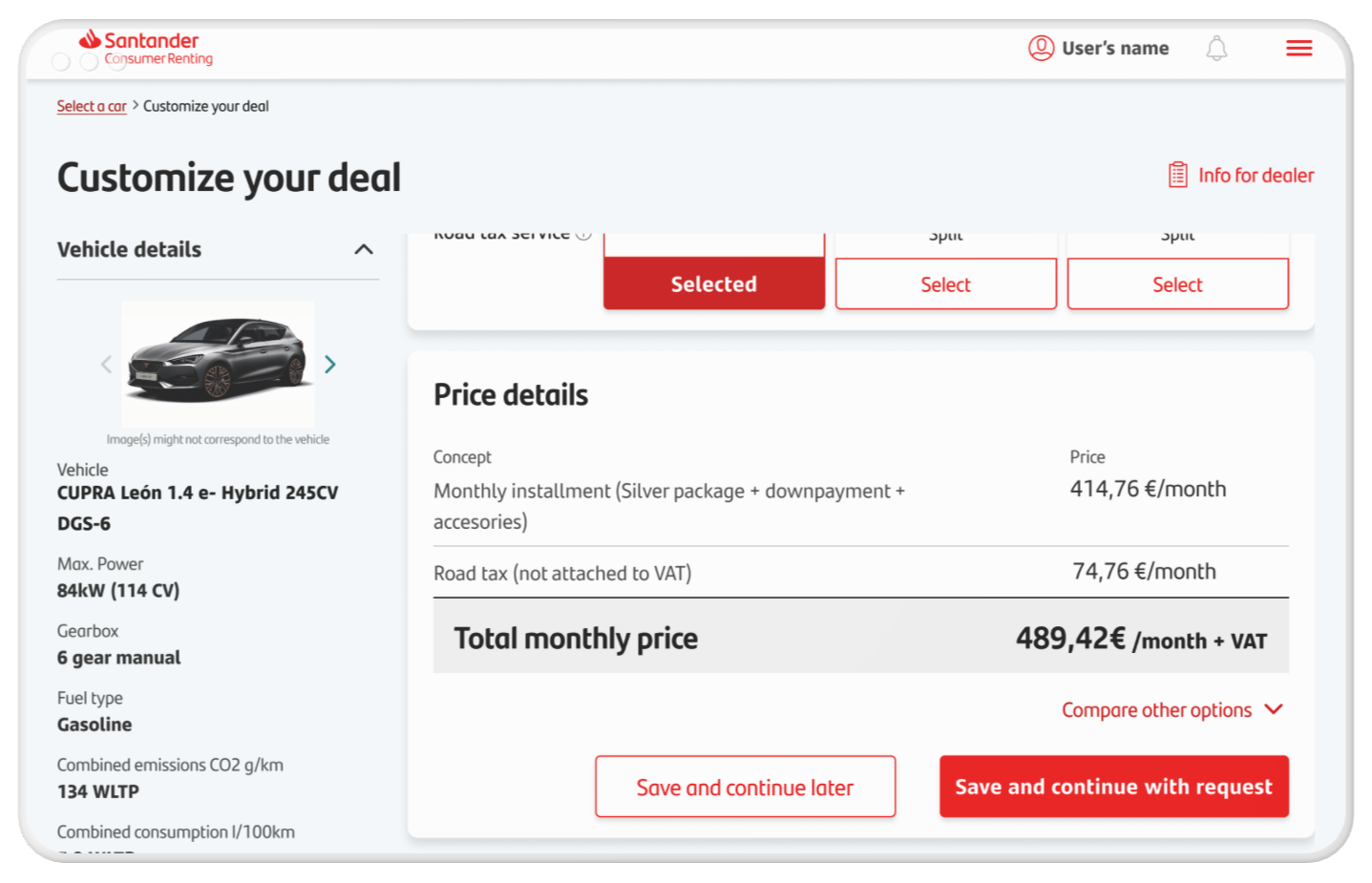
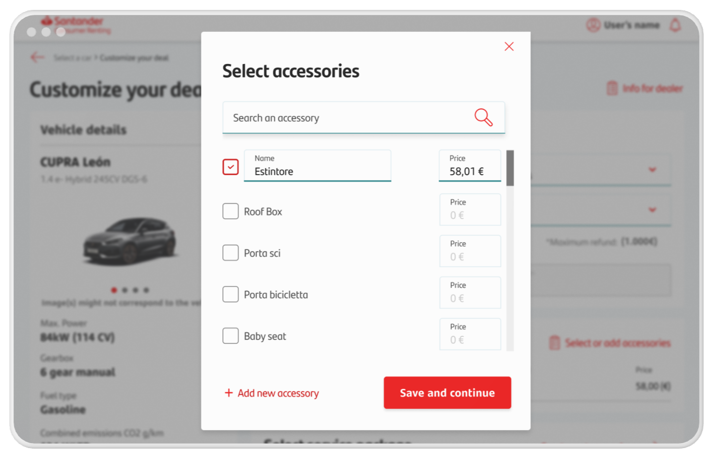
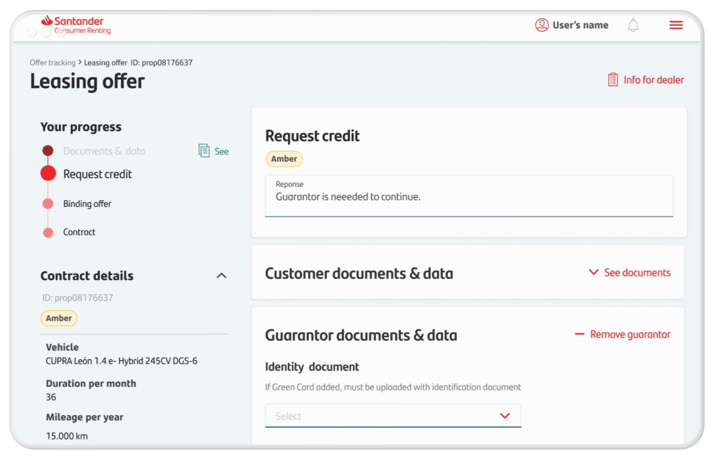
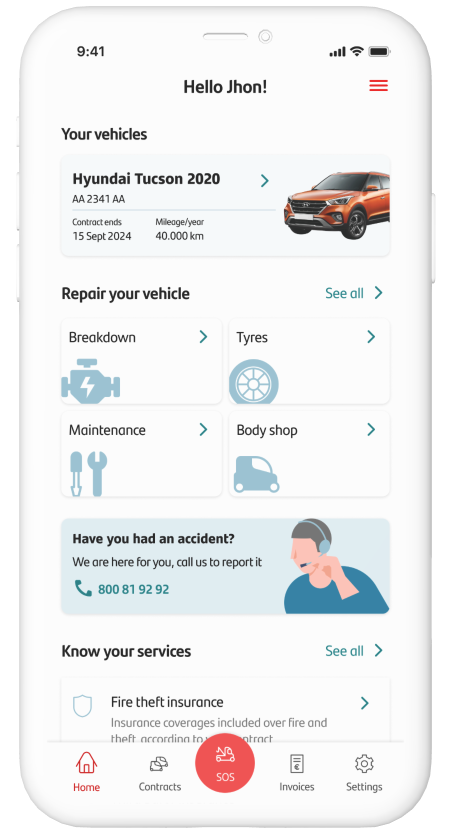
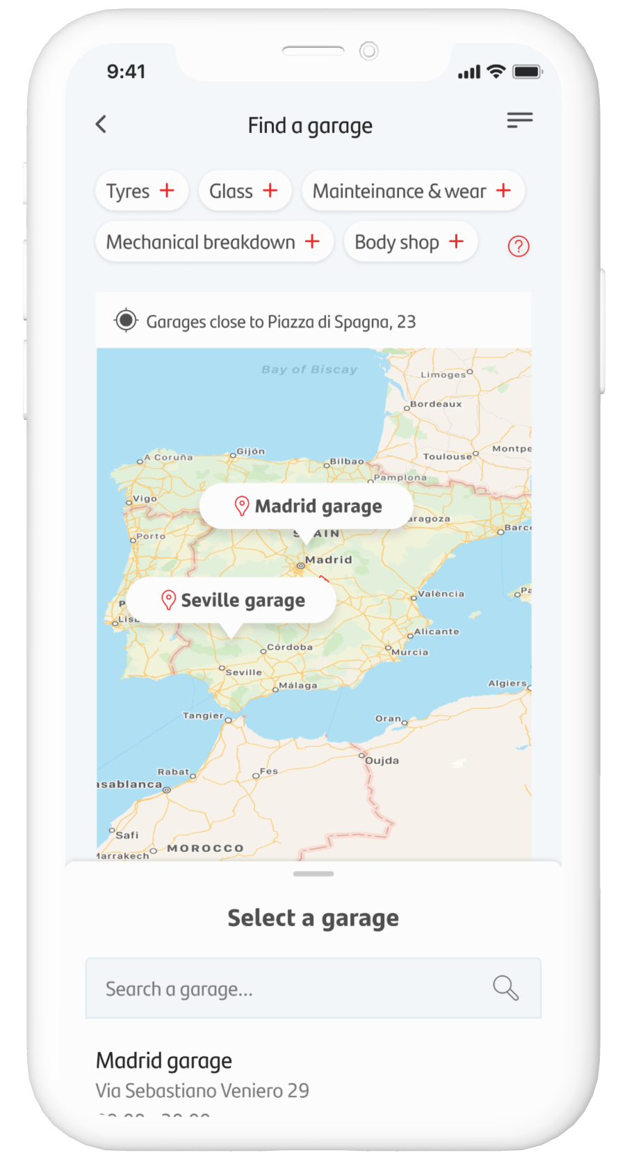
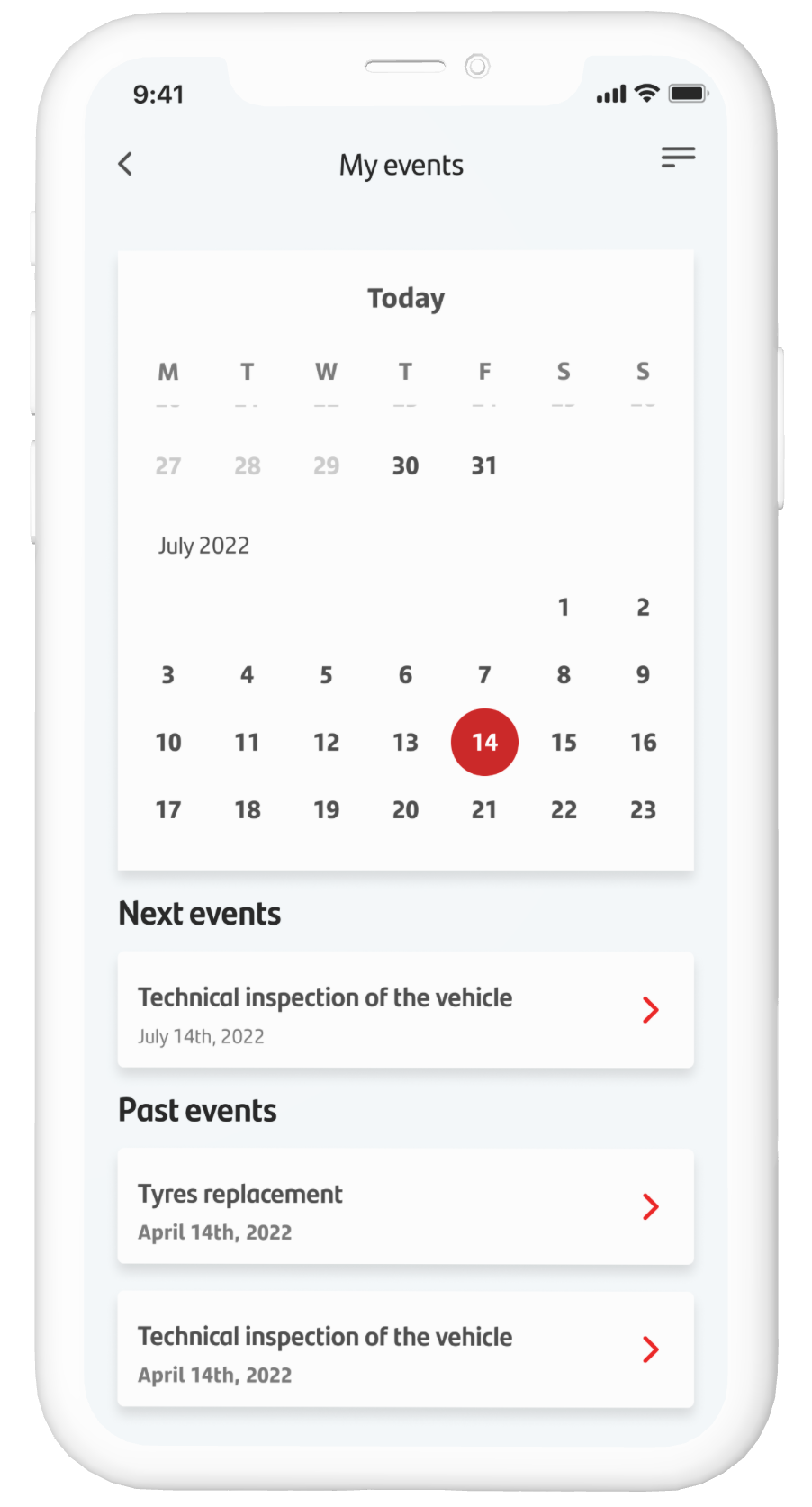
- Designed interactive flows to simplify key tasks like browsing vehicles, managing contracts, and making payments.
- Created high-fidelity prototypes to visualize the experience and gather internal buy-in
- Test & Validate:
- Conducted usability testing with a select group of customers to validate the design before launch.
- Presented findings and prototypes to stakeholders, ensuring every decision was backed by data and user insights.
- Implement & Refine:
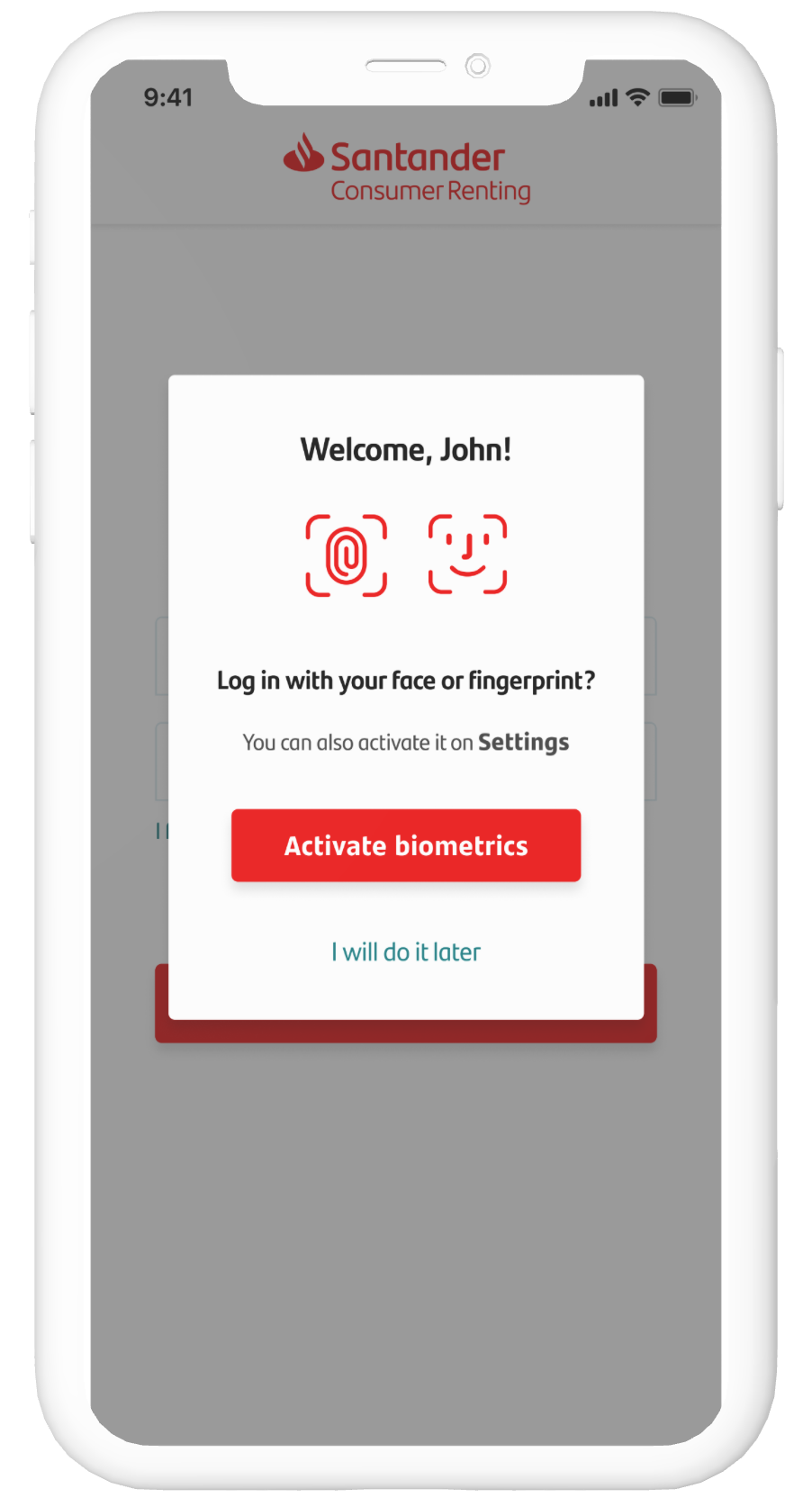
- Collaborated closely with developers to bring the designs to life in the Santander Consumer Autos app.
- Monitored post-launch performance and gathered feedback to make incremental improvements.
- This traditional Design Thinking approach allowed me to deliver a polished, market-ready product while navigating the constraints of a large organization.
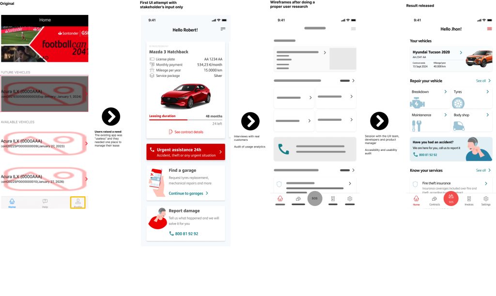
Sample of iterations
The Solution: A Leasing Experience That Delights
The redesigned app wasn’t just functional—it was transformative. Key features included:
One-Click Leasing: Enabled users to lease cars online in just a few steps, eliminating paperwork and phone calls.
Smart Reminders: Automated notifications for contract renewals, payments, and terminations, keeping customers informed and in control.
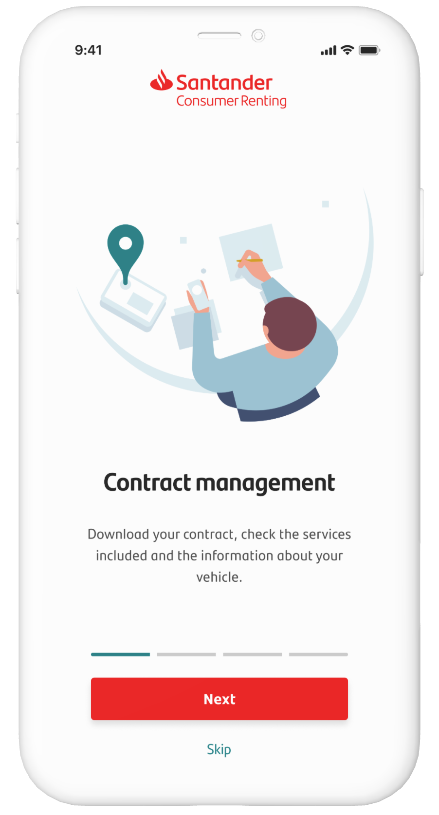
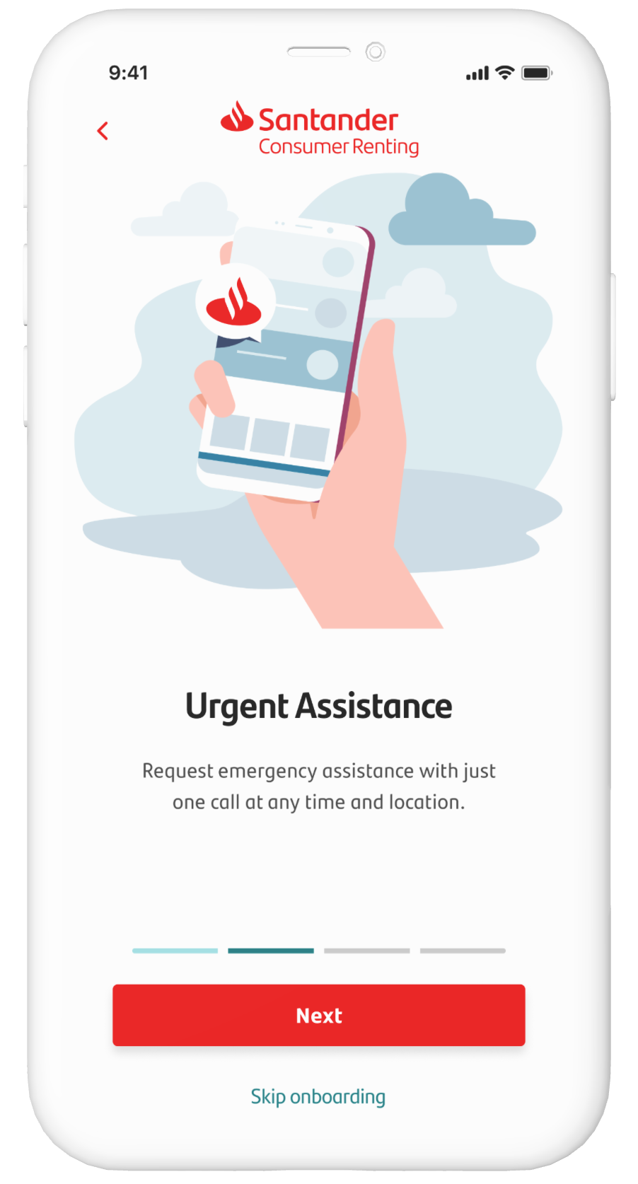
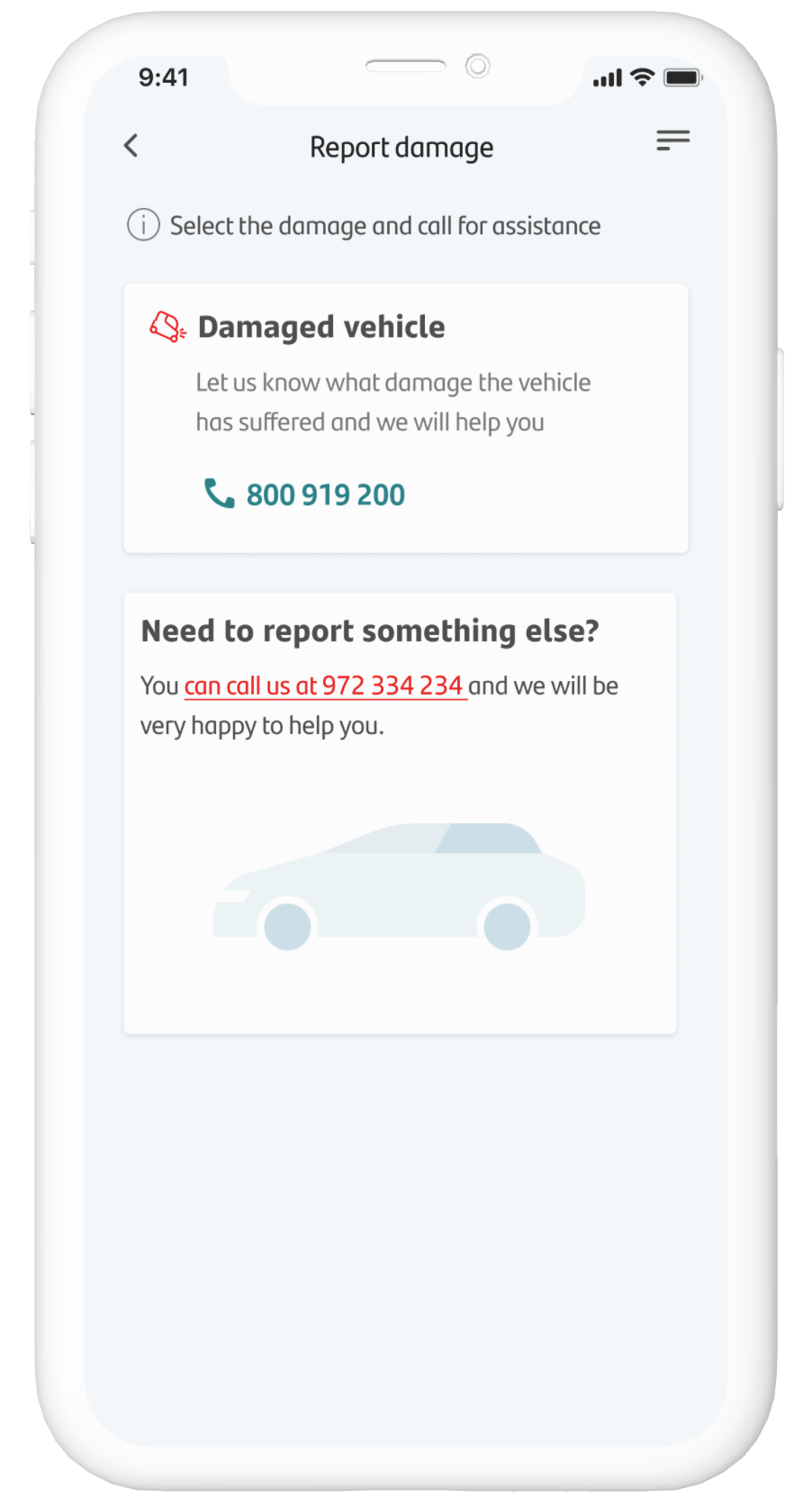
Instant Support: An interactive FAQ section and chatbot provided instant answers, reducing the need for customer service calls.
At the same time, the optimized internal platform streamlined workflows for Santander employees, making their jobs easier and more efficient.
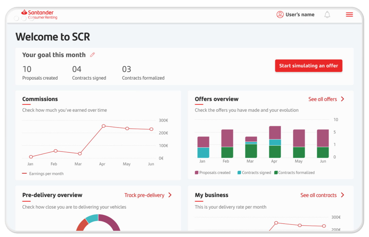
The Impact: Driving Happiness and Efficiency
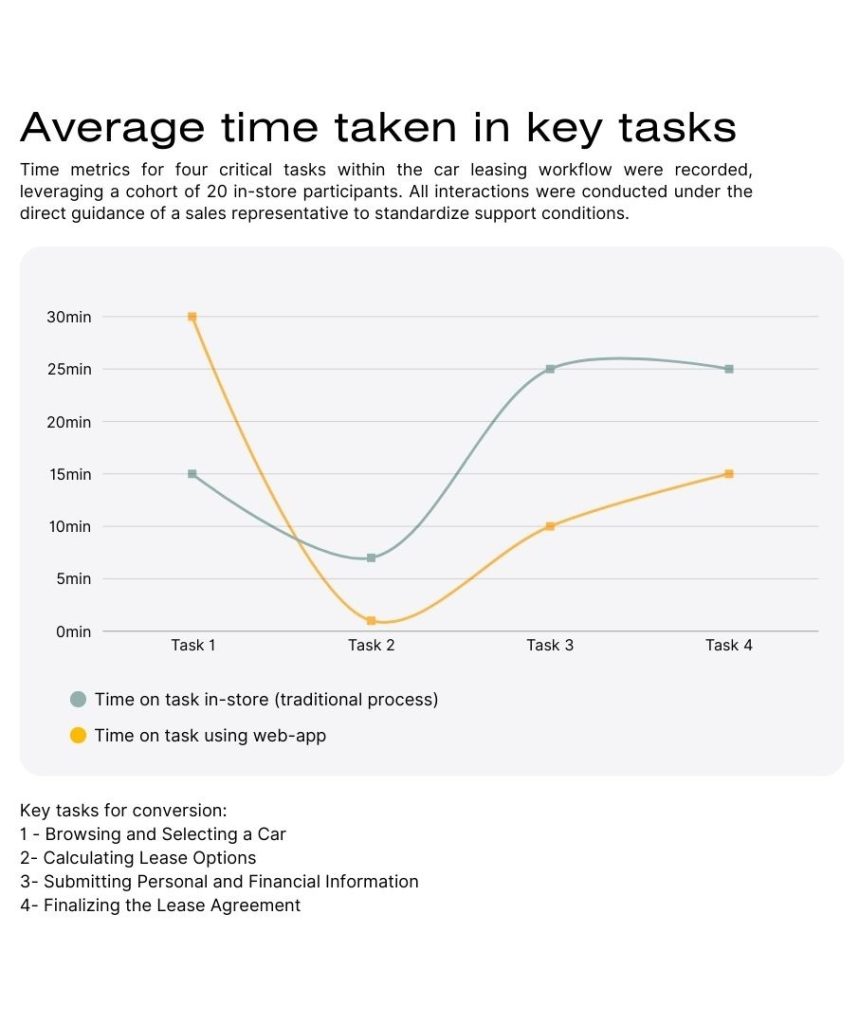
Using task-driven usability tests we discovered that the implemented product had great results:
- 30% less time in leasing processes: Users completed transactions much faster and without the need for telephone support.
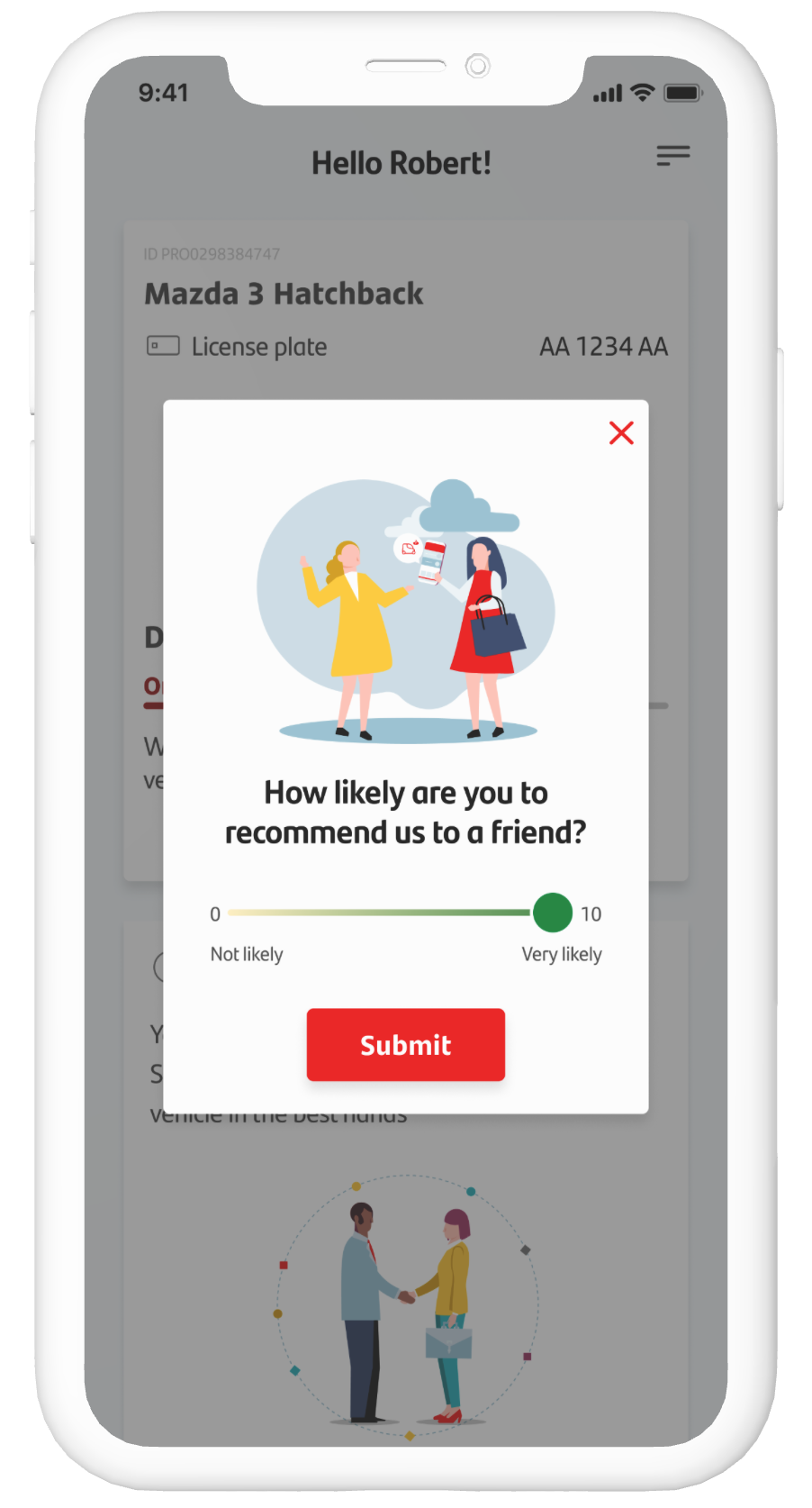
- 50% more digital adoption: The app’s intuitiveness and accessibility attracted new users.
Internal satisfaction: Customer service teams reported a significant reduction in workload thanks to customer self-management.
