Redesigning the Litio IoT App: A UX Case Study in Smart Lighting Innovation
How I led the redesign of Litio’s smart lighting app to create a seamless, user-friendly hub for controlling IoT-enabled LED systems. Boosted daily active users by 40% and reduced support tickets by 25%
The Spark: Litio’s Vision for Smarter Lighting
Litio isn’t just another IoT company—it’s a pioneer in smart LED lighting, blending energy efficiency with cutting-edge tech to create lighting systems that adapt to your life.
Think lights that dim when you’re binge-watching Netflix or brighten up your morning routine without you lifting a finger. But here’s the catch: their app, the heart of this smart ecosystem, felt more like a tangled web of settings than a seamless control hub.
My mission? To redesign the Litio app into an intuitive, delightful experience that would make users fall in love with their lights all over again.
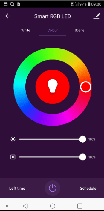
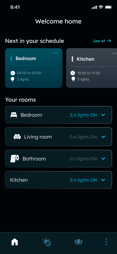
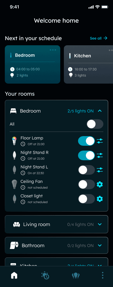
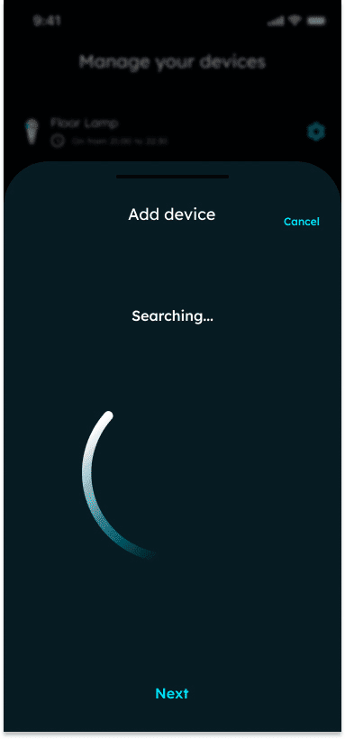
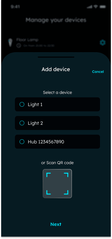
Original app
The Problem: When Smart Tech Feels… Not So Smart
Let’s face it—smart tech is only as good as the experience it delivers. Litio’s app was functional but frustrating. Users struggled with clunky navigation, inconsistent feedback, and limited customization options. The result was low engagement, frequent support calls, and a missed opportunity to showcase the full potential of Litio’s lighting system.
The goal was clear: simplify the app, make it visually appealing, and empower users to personalize their lighting experience without breaking a sweat
The Cast: Who Were We Designing For?
Every great story has its characters, and this one was no different. We identified three key personas:
Eco-Warrior Emma: A homeowner who wants to save energy (and money) by automating her lights.
Facility Manager Frank: A busy professional who needs to control lighting across multiple buildings from his phone.
Designer Dave: A creative soul who dreams of crafting the perfect ambiance for every occasion.
Understanding these users was the secret sauce to designing an app that felt tailor-made for each of them.
The Team: Collaboration in Action
This project was a true collaboration, run on a Scrum framework with a two-quarter timeline to deliver a fully redesigned app. As the lead UX designer, I stepped in with a Lean UX approach, focusing on rapid iteration, user feedback, and cross-functional collaboration.
I worked closely with the product manager to define priorities and align on business goals, while also partnering with developers to ensure technical feasibility. My role wasn’t just about guiding the process—I rolled up my sleeves and dove into the design work, creating wireframes, prototypes, and high-fidelity screens.
The team was small but mighty:
1 Product Manager: Kept us aligned on business objectives.
2 Developers: Brought the designs to life with precision.
1 Visual Designer: Polished the interface to perfection.
Me (UX Designer): Led the charge on research, strategy, and design execution.
The Challenge: Delivering Big in Two Quarters
With just two quarters to deliver a fully redesigned app, the pressure was on. The project kicked off with a clear goal: simplify the app and make it a joy to use. But as we dug into user research, we uncovered an opportunity to add energy usage analytics—a feature users craved but one that added complexity to our timeline.
This is where Lean UX truly shined. By breaking the work into two-week sprints, we could prioritize ruthlessly and iterate quickly. I led weekly syncs with the PM and devs to align on priorities, review progress, and address blockers. These meetings were critical to keeping the project on track and ensuring everyone felt heard and supported.
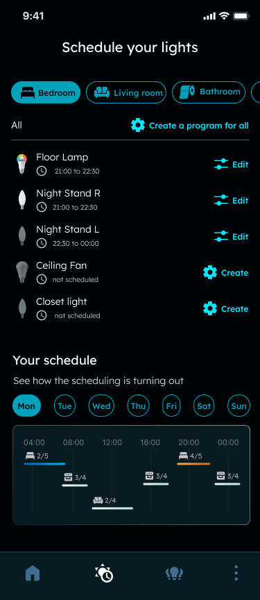
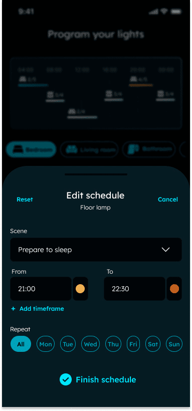
Constraints like these forced us to focus on what mattered most: streamlined navigation, customizable lighting scenes, and real-time energy insights. It wasn’t easy, but it was incredibly rewarding to see the team rally around a shared vision.
The Journey: From Chaos to Clarity
Here’s how we turned this app into a user-friendly masterpiece, step by step:
Kickoff & Alignment: I facilitated workshops with the PM and devs to align on goals, timelines, and success metrics. This set the stage for a smooth collaboration.
Research & Discovery: Conducted user interviews and competitor analysis to uncover pain points and opportunities. Shared findings with the team to build empathy and alignment.
Lean UX in Action:
Rapid Ideation: Led brainstorming sessions to explore solutions and prioritize features.
Wireframes & Prototypes: Created low-fidelity wireframes to map out user flows, then iterated into interactive prototypes for testing.
Usability Testing: Tested prototypes with real users, gathering feedback to refine the design.
Design Execution: Worked hand-in-hand with the visual designer to create a polished, cohesive interface that felt unmistakably Litio.
Development Collaboration: Held regular check-ins with developers to ensure designs were implemented accurately and efficiently.
Launch Prep: Coordinated with the PM to plan the rollout, ensuring a smooth transition for users.
Throughout the process, I wore many hats: researcher, strategist, designer, and facilitator. But my favorite part? Getting hands-on with the design work, crafting pixel-perfect screens and interactions that brought the app to life.
The Big Reveal: Results That Speak for Themselves
The new Litio app wasn’t just a redesign—it was a transformation. Within three months, we saw:
A 40% increase in daily active users.
A 25% drop in support tickets.
Rave reviews for the app’s ease of use and customization options.
Some key points:
Focus on what matters: Prioritizing key features saved us time and kept the project on track.
Test early, test often: User feedback was our compass.
Collaboration is key: Working closely with the team ensured we delivered a product that was both beautiful and functional.