
How can we provide an advanced service that makes life easier for investors? This is the question that Investia asked to its stakeholders.
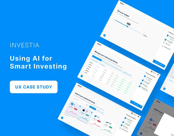
Investia is a financial entity specialized in investment products and services listed on the European stock market. Drived by technology and innovation, the engineers of Investia have developed an Artificial Intelligence tool that helps you grow your wealth with portfolios curated by machines.
In this case, the investment revolution needed to be accompanied by a user-friendly system in which novices and experts could easily complete the process.
Understanding the business
This is probably the most complex system I have come across. Me and my colleagues did deep desk research and had very insightful sessions with stakeholders to understand the details of the current business model.
Ease of use was paramount, and we had to ensure from the first step that there would be no room for errors in entering any financial data. In order to have the appropriate research without having direct contact with the end user and to be able to create a user experience for this tool, we needed the current data, for this we had a session with the Investia marketing team and used national data.
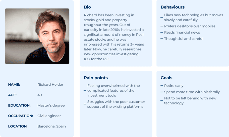
Who makes investments?
Our persona hypothesis consisted of two different archetypes which we used to facilitate decisions about our user needs, desires, their lifestyle and aspirations in contexts of use, for the sake of this case study I will only consider a Simple investor profile.
As our users are older and not used to using new platforms, the user interface (UI) had to be intuitive and modern while keeping in mind responsiveness and user preferences. We needed to create a UI easy for the customer to navigate and use. This way, users don’t have to search for features and functions that should be a click away.
The first part of the project was to work on the web application. Users don’t want to spend their time learning how to use a new software — they want intuitive, easy-to-use software, or they will find another product to use.
Analysis
The time was limited: we were to release the first product within 3 months. That’s why we agreed not to design the whole interface at once but to progress in small iterations, block after block.
Information architecture
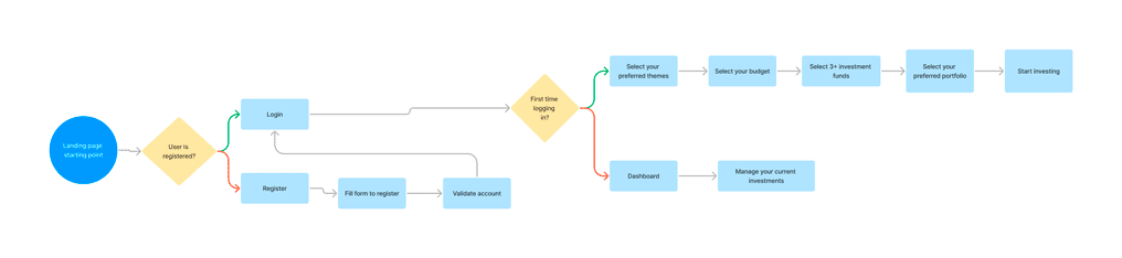
The first block of work was the product flow chart which defines the whole path, this allows us to make sure that we are working in the right direction and understand principal points. It’s easier to determine the client’s preferences from the design concept stage rather than create one based on just gut feelings.
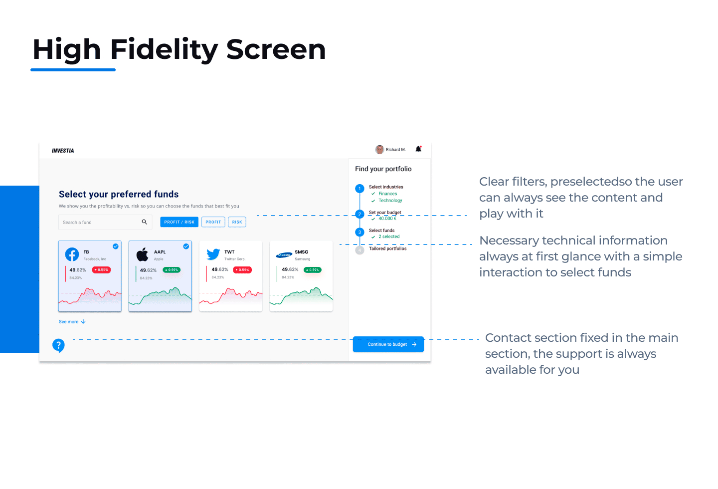
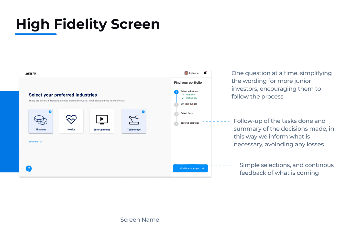
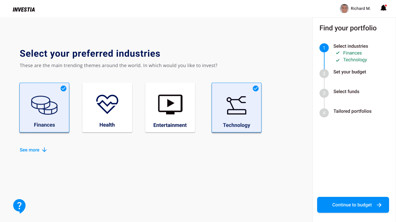
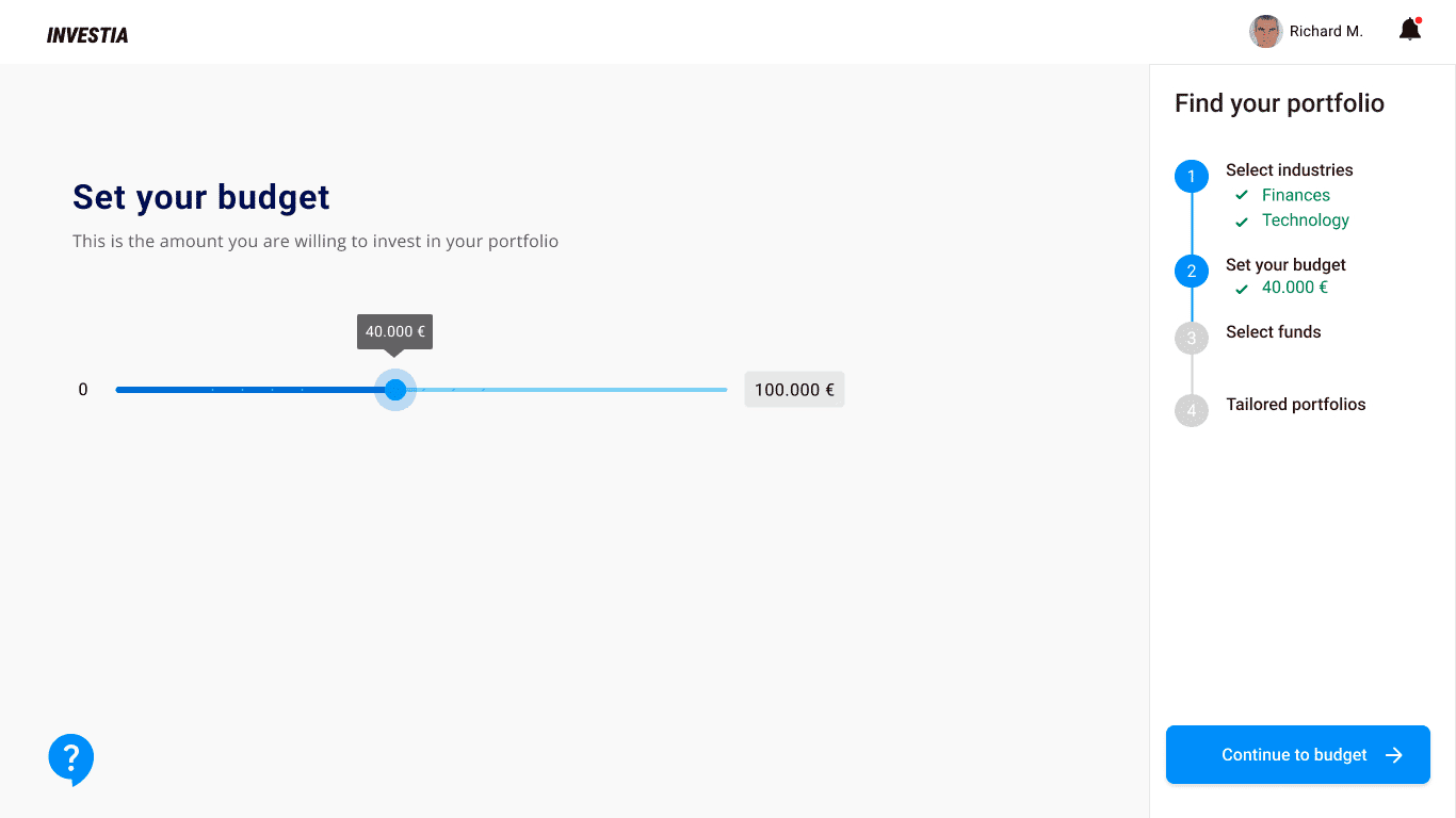
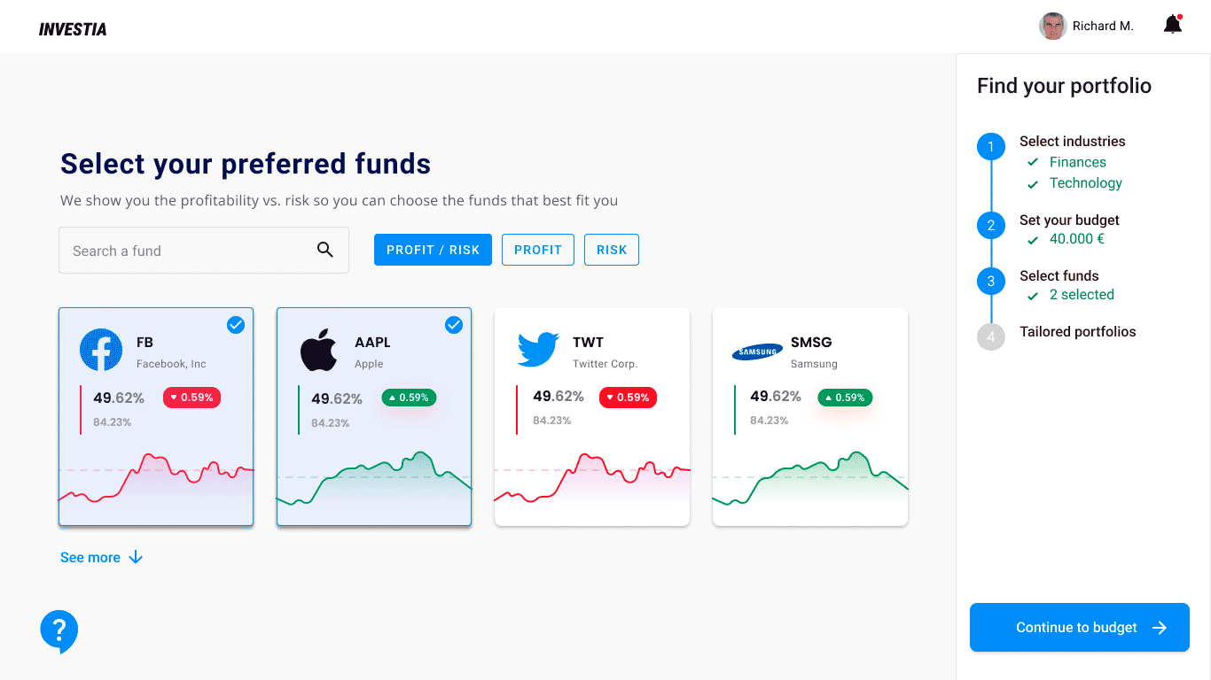
As this is a process that needs too much data input, for this we split the form into single questions at a time
Ideation & design proposal
After we had a better understanding of user behavior and product structure, I have listed some key features of the app in order to create wireframes. I design both low fidelity and high fidelity designs based on the project needs.
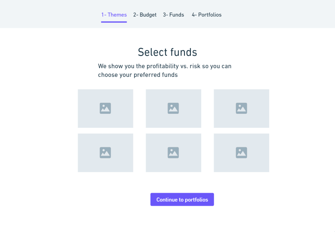
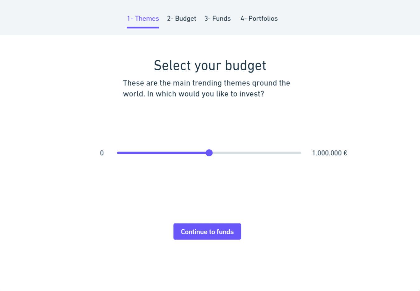
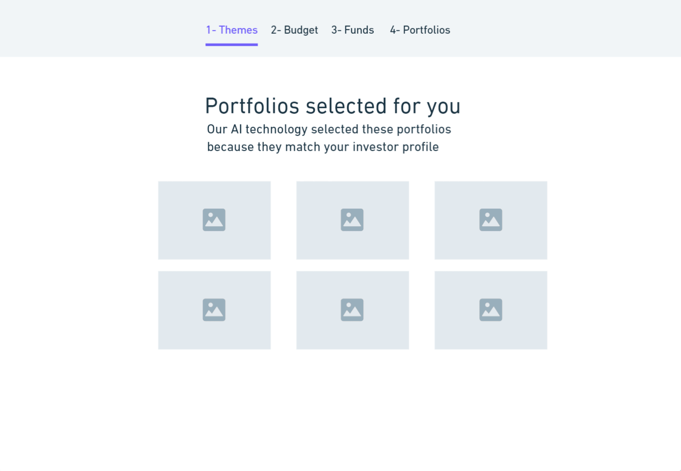
Low-Fidelity Wireframes
Approaching from a black-and-white pictureless perspective allowed me to focus on the layout and complete all the screen states before getting caught up in details, such as font, iconography, and colors.
Usability Testing
Before the High fidelity wireframes, we made testings with with biased users (stakeholders) and unbiased users (new investors) to determine if the initial wireframe was understandable and easy to navigate.
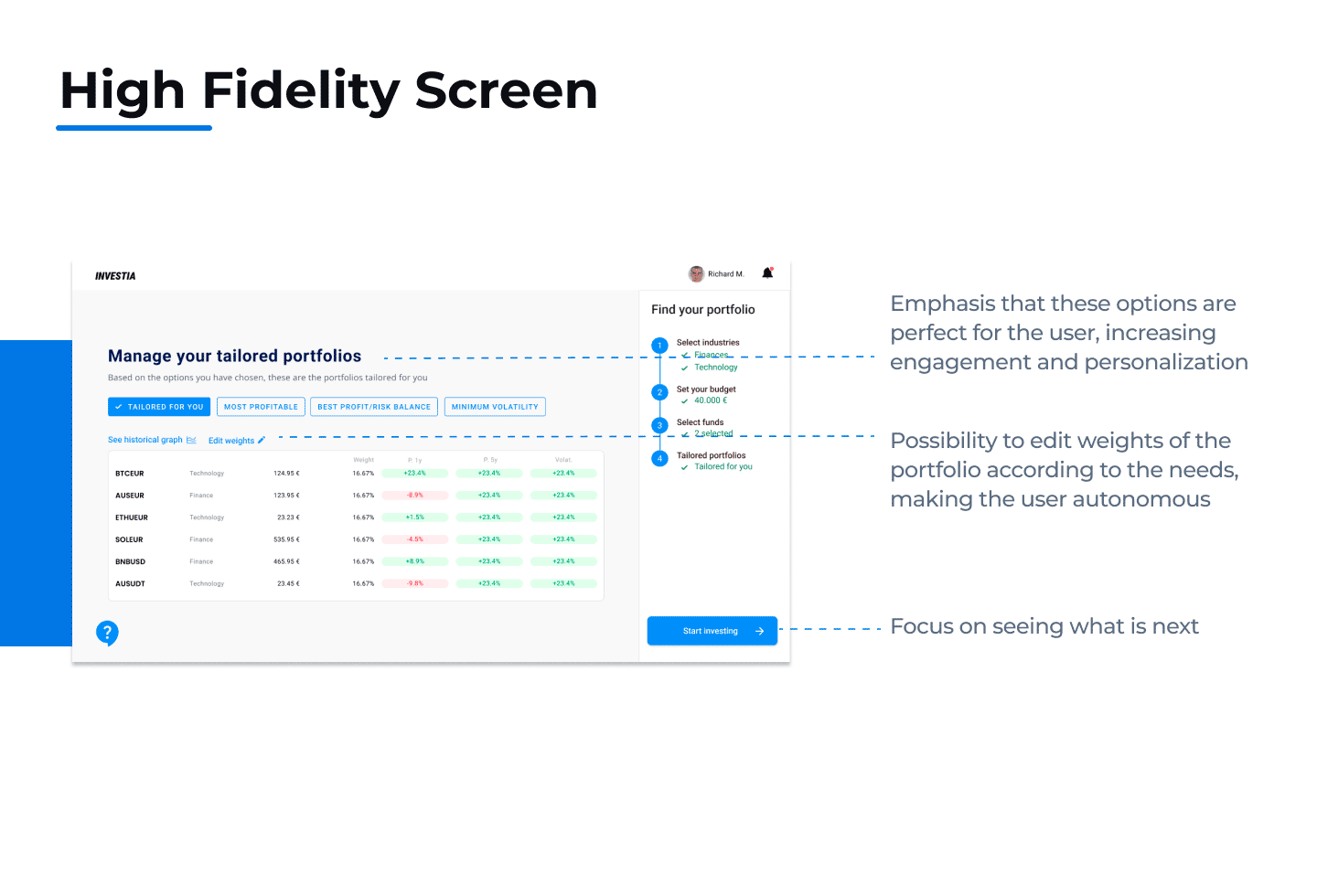
After some iterations within the design team, we finally developed the High Fidelity protypes
High-Fidelity Wireframes
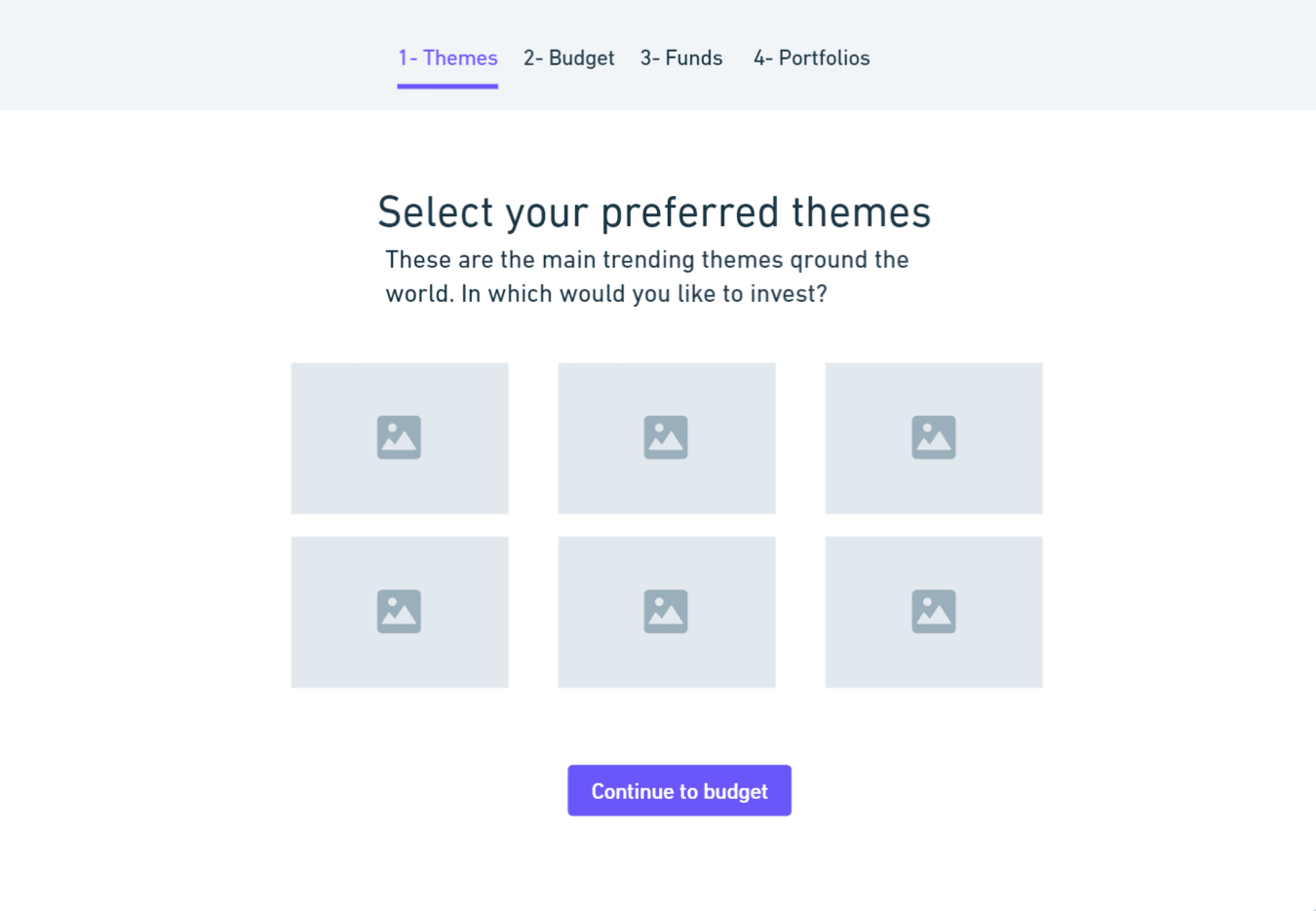
Equipped with draft wireframes and ideas on app screens provided by the client, we got started work on wireframes’ enhancement and UI/UX design anticipating users’ movements and their step-by-step interaction with an app. My goal was to develop a solid UI/UX design and build in unique features for high-level functionality to make the experience of the user meaningful and valuable.
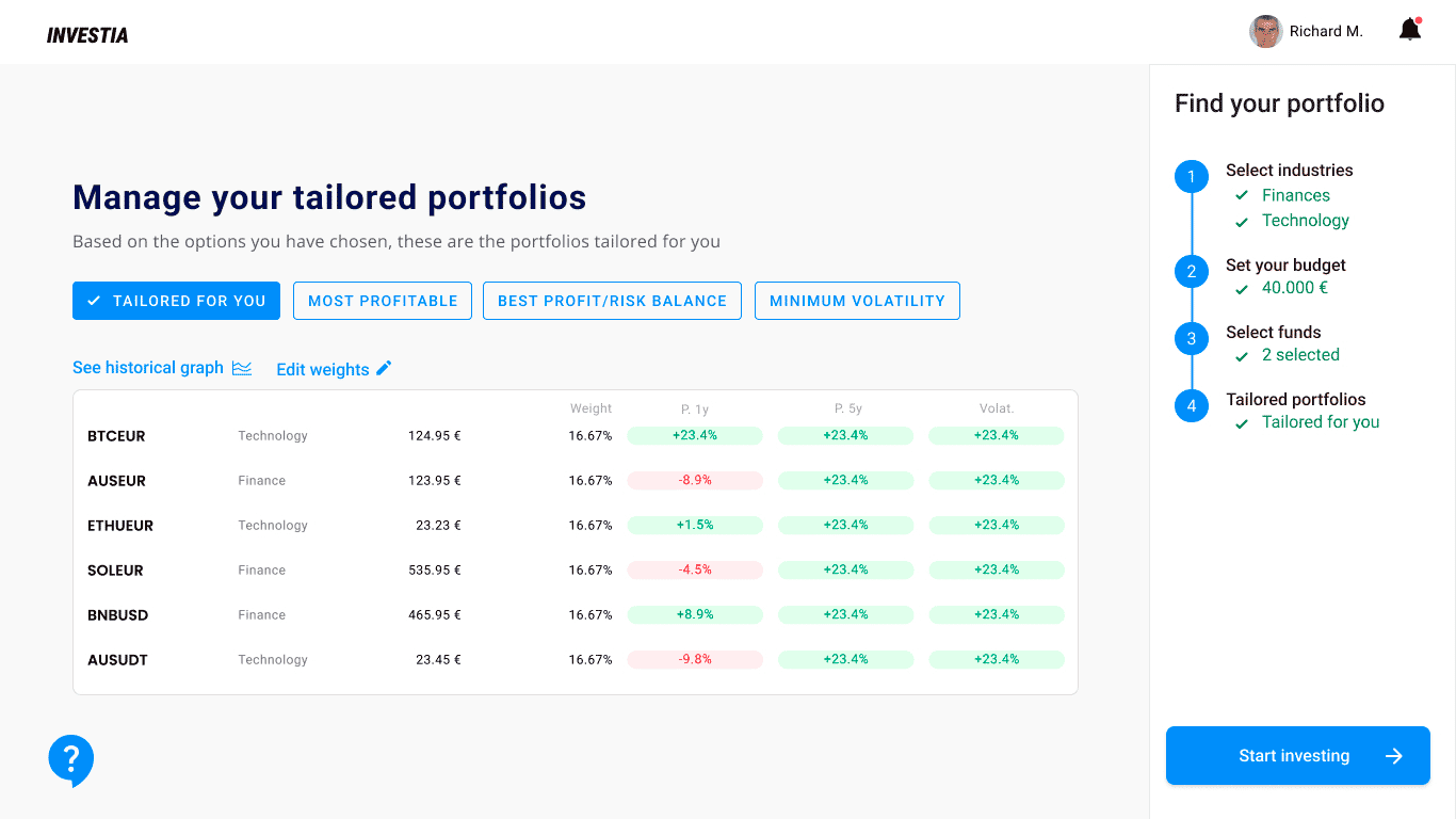
The page contains all information that is important for making a decision on linking an account to the strategy: dealings record and the result of each, portfolio, characteristics, and details of a strategy plus chat with other investors (to ask for advice, if you need it).
Prototype & Test
Usability Testing, again
It’s the key ingredient to UX, after all. I conducted one in-person usability test on my prototype. My subject was an unbiased expert investor, a behavior that I really liked to see during this test is that the user was curious and excited to see what came next.
Overall, the user said the experience was positive, stating that “having fewer spaces to explore or click [and] displaying everything concisely in just one space helped me comprehend the process easily.”
The work is done! (for now)
Since Investia works as a web-application, we made implementations not only for 1280 and 320, but also for 768, 1024, and 1440. In general, it’s really cool (I didn’t expect this though 🙂)
The next step would be the iOS and Android application so the users can manage their investments from everywhere.