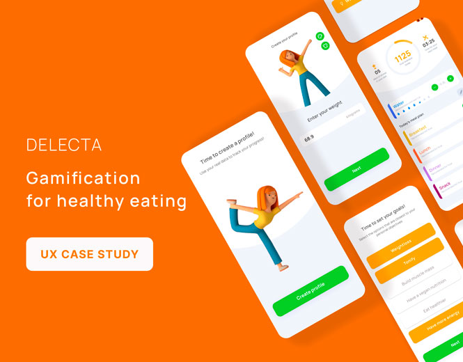
We all enjoy a good meal — but if there’s one thing in life that has a crappy user experience, it’s dieting. It is often hard to be consistent in learning what’s good for you. Lots of people track their food intake for diverse reasons: from managing particular health conditions to achieving weight-loss, or muscle gain goals.
Delecta promises users that they’ll never need another diet app. Does the user experience back up this ambition?
For this project, I worked as a UX/UI designer making a dream team with another designer. We carried out all the stages together and collaborated very closely with the stakeholders and 2 iOS devs under a combined methodology Agile Scrum + Design thinking.
Current situation and objectives
The goal is to make a fun and easy experience around dieting. Using a combination of gamification, intuitive nudges and effective data visualization, the app aims to help users “meaningfully engage, make better food choices and successfully change their behaviors for the long term.”
Understanding the market
We found that the generation between 20 and 30 years old, seems to see food not just as necessary but also as an adventure. As stated in Instagram global statistics, almost 70% of millennials take photos of their meals before eating to capture the momentum of their dining experience.
Additionally, 4 times more content is consumed by food lovers on Instagram compared to the average user. Other social channels popular among Generation Z like Snapchat and TikTok also have high user engagement in food-related content.
This took me to the conclusion that this food tracking product should focus on the psychology of weight loss, and on offering a range of customized plans based on user lifestyle.
Who would pay for fun dieting?
To find these motivations and understand the real context of the possible users previously defined, I gathered 5 users who are familiar with nutrition apps living in Spain and England. I scheduled a 1 hour session so they can tell me their process and main pain points during the journey.
I focused on non-leading, open-ended, and Likert scale questions to uncover any patterns users may have when looking to achieve weight-loss, or muscle gain goals.
The main takeaways worth to mention here are:
- ⅗ users would only use the app to log food and track calories
- ⅗ users have used a meal tracking app in the past
- ⅘ users regularly engage in physical activity and have done so in the past
- ⅕ users said they would make use of blog features on the app
- ⅘ users said they have trouble remembering to log their meals
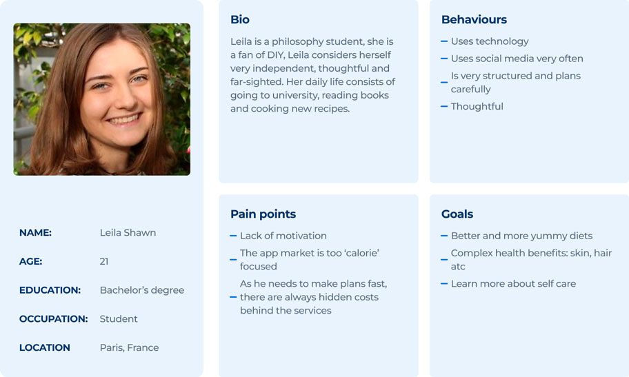
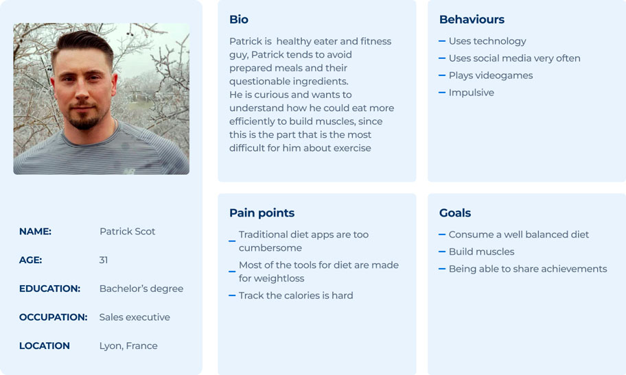
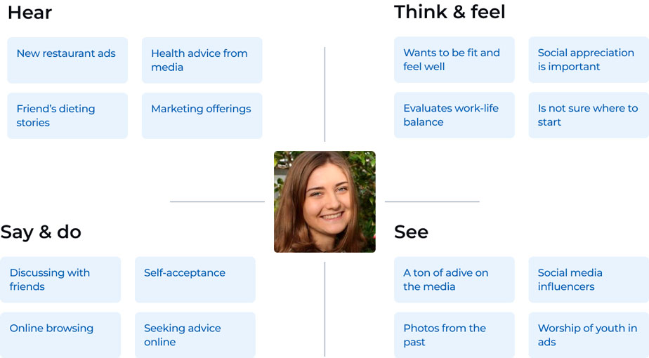
2 User personas & empathy map
Usability Testing
We tested 2 existing apps whose objective is to help users to improve their diet habits with 3 users and ourselves (designers, known as biased users) during a period of 3 days.
From these tests a main frustration arose that confirms the theory that was held, and that is that the apps are not motivating enough to maintain discipline in the long term and three main points were noticed:
1- Users appreciate meal ideas
2- Complex UI interfaces lead to drop off the diet, this is especially serious since we are trying to help improve good habits on eating for health
3- Entering what you have eaten should be easy and fast, it should not take more than a couple of minutes
Analysis
With all the previous information, I wanted to address the user pain points by including (and improving) the core features of the application. So we structured all the findings and sorted them with developers to define the functionalities for the MVP.
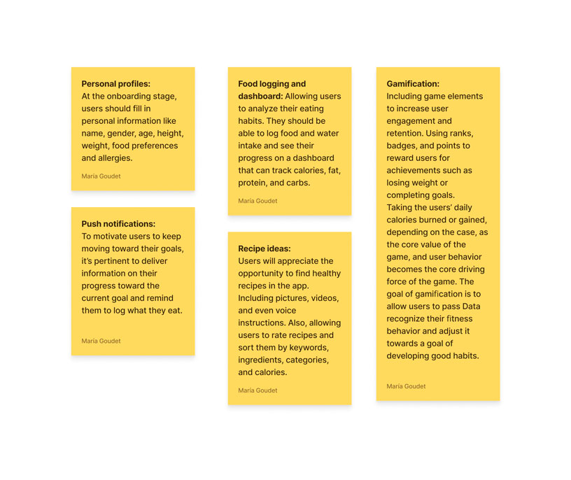
Flow diagram
To organize and maintain a useful and usable body of information I structured a basic hierarchy by conducting card sorting and tree testing exercise
This is a flow for the happy initial path:

Ideation & design proposal
Sketched Mockups
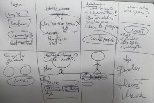
I sketched the wireframes by hand to ensure I could effectively iterate and passed the most solid proposals to digital whiteboards. I consulted my flow diagram to mentally visualize page states.
High-Fidelity Wireframes
Once the initial framework of the application was ideated, my colleague created low fidelity prototypes which we tested with the team and presented it to stakeholders.
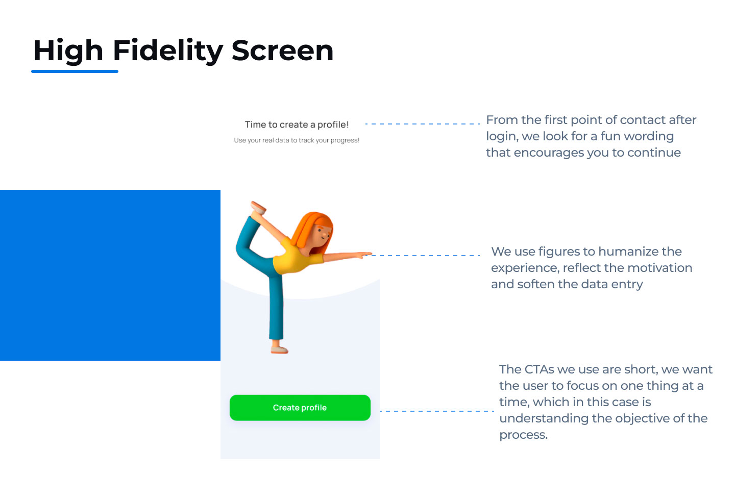
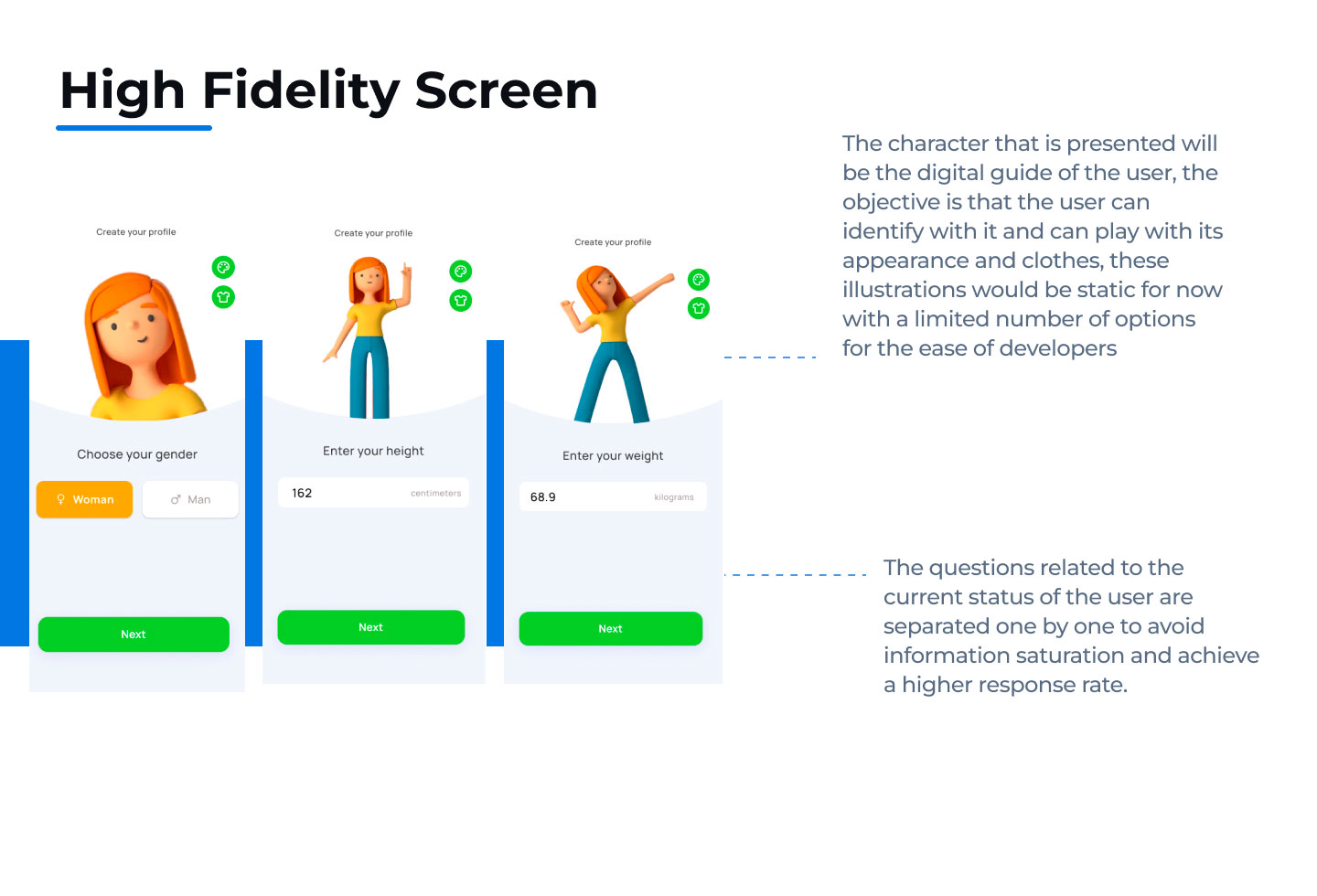
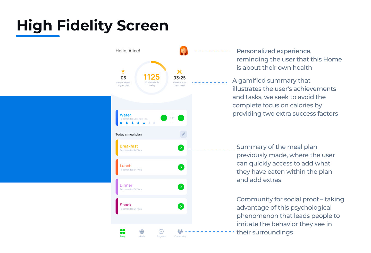
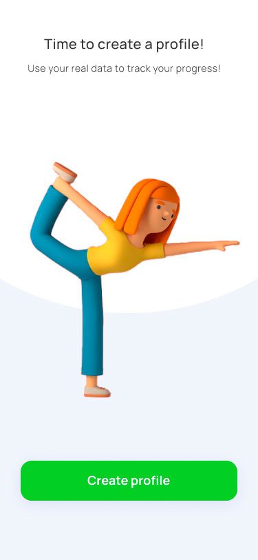
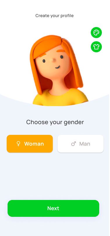
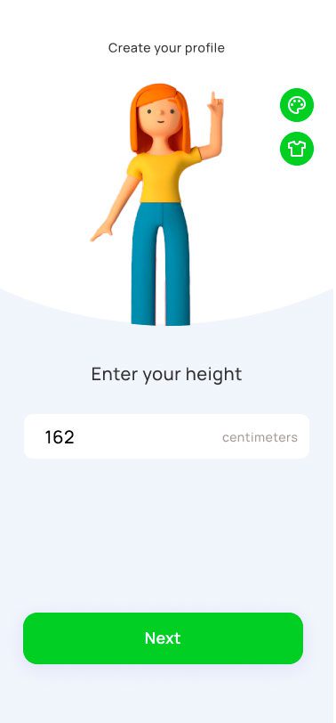
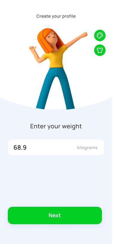
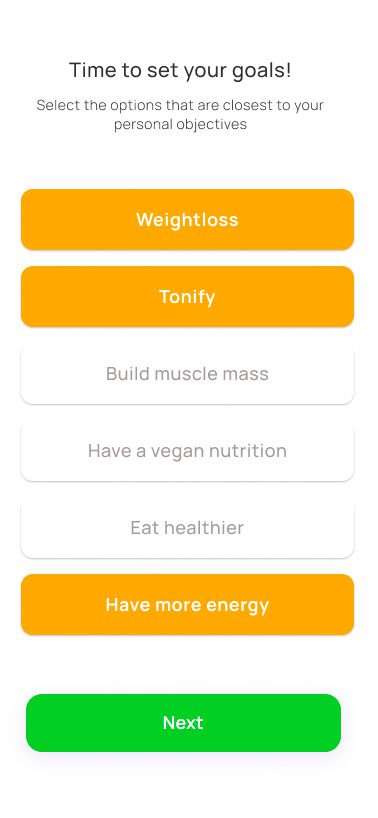
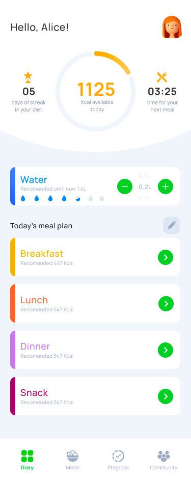
To prepare for usability testing, I created the high-fidelity prototype that connected the primary user flow of inputting new meals, viewing recipes, and tracking health details, for confidentiality reasons I will only show onboarding + home screens
Prototypes & test
To validate my proposed design solutions, I tested my prototype on 5 people. I observed users to understand how easily they navigated through the app, what they thought would happen when certain buttons were pushed, and any moments that tripped them up.
I discovered that the designs (thankfully) did not have any catastrophic usability problems that stopped users from accomplishing the core tasks.
“One of the main focal points of the app is to have your personalized health data be readily available to you, to help you see how close you are to achieving your goals”
Outcomes & final iterations
I included Gamification (‘Streaks’) in order to encourage users to use the app for every meal. Allowing users to turn everyday activities into games by awarding points for consistency as encouragement.
I hoped to circumvent that problem by breaking down information into bite size chunks in forms of easy to read diagrams and illustrations. Every day the app shows users habit-forming tasks on the home page.
By helping users understand their behaviors and conditions better and by simplifying dieting using gamification, user compliance rates can be increased to achieve better outcomes.
