Diseño Web y UX
Gransolar Connect
¿Cómo trabajan realmente las personas con los datos solares una vez que los paneles ya están instalados?
Esa pregunta enmarcó el trabajo en Gransolar Connect.
La plataforma fue diseñada para equipos que ya operan en el sector de la energía solar, personas que se ocupan del rendimiento, los incidentes y las decisiones a diario.
El desafío no fue introducir el dominio.
Fue soportarlo.
Servicios:
• Estrategia UX
• Diseño de experiencia
• Diseño de interfaz
Industria:
• Energía renovable
• Solar
• Software empresarial
El equipo:
• Gestión de producto
• Desarrollo front-end y back-end
• Marketing
• Diseño UX (yo)
• Representantes de Negocio
Año:
2020
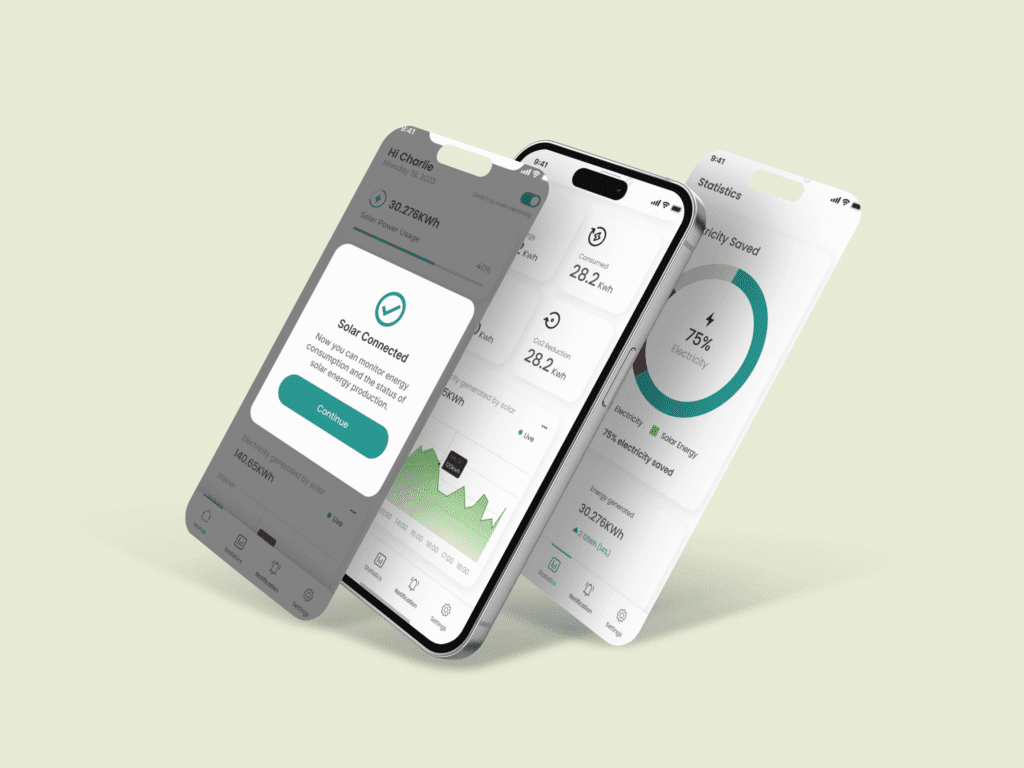
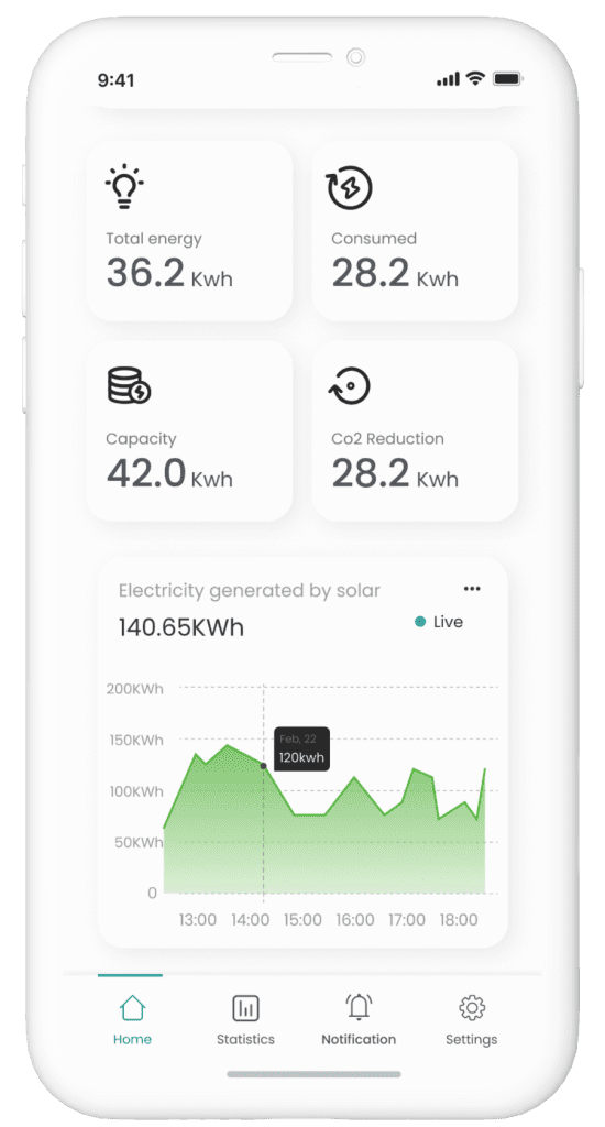
Qué es Gransolar Connect
Gransolar trabaja en todo el sector de la energía solar, apoyando el desarrollo y la operación de instalaciones a gran escala. Sus equipos se basan en información precisa y sistemas claros para supervisar el rendimiento y reaccionar cuando sea necesario.
Gransolar Connect fue concebido como un producto interno para reunir esa información en un solo lugar.
Descripción del proyecto
El proyecto implicó una estrecha colaboración entre gerentes de producto, desarrolladores y marketing. La aplicación nunca se concibió para su lanzamiento público; se creó como una herramienta privada para apoyar a equipos internos y usuarios seleccionados.
Por ello, las expectativas eran altas. Los usuarios estaban familiarizados con el dominio y eran sensibles a cualquier cosa que los ralentizara o les resultara confusa. La plataforma debía integrarse en los flujos de trabajo existentes, en lugar de reemplazarlos.
Alcance
El trabajo se centró en cómo se accedía a la información, se interpretaba y se actuaba en función de ella.
Las sesiones con los equipos de producto y técnicos ayudaron a identificar dónde se perdía tiempo, dónde las decisiones parecían más difíciles de lo debido y dónde las herramientas existentes generaban fricción. Las decisiones de diseño se tomaron junto con el desarrollo, ajustándose a medida que las limitaciones y los patrones de uso reales se aclaraban.
Las pantallas se estructuraron en torno a tareas, no a funciones. Las etiquetas y las agrupaciones de datos se revisaron repetidamente para reducir la ambigüedad. El objetivo era que la plataforma fuera lo suficientemente predecible como para ser confiable, sin reducir la complejidad del trabajo en sí.


Resultado
El resultado fue una plataforma privada que apoyaba el trabajo operativo diario sin llamar la atención.
Los equipos lo usaron para revisar el rendimiento, comprender tendencias e identificar problemas sin depender de múltiples herramientas inconexas. Su uso se mantuvo estable a lo largo del tiempo, especialmente entre los usuarios que anteriormente gestionaban la misma información mediante hojas de cálculo e informes manuales.
Internamente, las conversaciones cambiaron. Se dedicó menos tiempo a localizar datos y más a debatir su significado y las acciones a seguir. La herramienta pasó a formar parte del flujo de trabajo en lugar de ser un paso más.

Lo que este proyecto reforzó
Los dominios complejos no necesitan interfaces más ruidosas.
Necesitan interfaces más claras.
Este proyecto destacó el gran impacto que tienen las pequeñas decisiones en las herramientas internas, donde los usuarios regresan a diario y las expectativas se configuran por la experiencia, no por las pantallas de incorporación. Diseñar aquí implicó escuchar atentamente y ajustar continuamente, a menudo sin gestos visibles.
Ese tipo de trabajo no siempre aparece en las capturas de pantalla.
Se nota en lo bien que funcionan las cosas después.