Diseño Web y UX
The Art Gorgeus
¿Qué sucede cuando una comunidad crece más rápido que el espacio construido para albergarla?
Esa fue la situación con TheArtGorgeous.
El público estaba allí. La voz era potente. El contenido había estado evolucionando durante años.
Sin embargo, el sitio web no había captado del todo a la gente que lo utilizaba.
El proyecto se centró en ayudar al sitio a reflejar quiénes eran realmente los lectores y cómo llegaban.
Servicios:
• Rediseño del sitio web
•Mejora de experiencia
• Estructura del contenido
Industria:
• Medios creativos
• Arte y cultura
• Publicación digital
El equipo:
• Equipo editorial
• Fundadores
• Diseño y desarrollo (yo)
Año:
2022
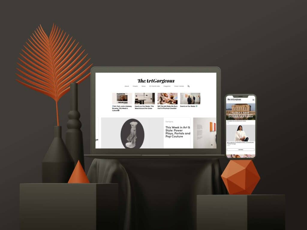
Qué es The Art Gorgeus
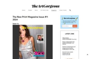
TheArtGorgeous es una agencia creativa global y plataforma de medios con una sólida presencia en diversos canales. Conocida por su cuenta de Instagram, su revista impresa y sus colaboraciones con marcas e instituciones, la plataforma lleva más de una década formando parte del mundo creativo.
Descripción del proyecto
El sitio web ya existía y se utilizaba activamente, pero su estructura reflejaba una etapa anterior de la plataforma.
La mayoría de los visitantes ya no llegaban a través de la navegación tradicional. Provenían de redes sociales, boletines informativos y enlaces compartidos, que a menudo terminaban en las partes más profundas del sitio. La experiencia debía funcionar igual de bien desde el centro que desde la página de inicio.
El reto no era cambiar la voz, sino apoyarla.
Alcance
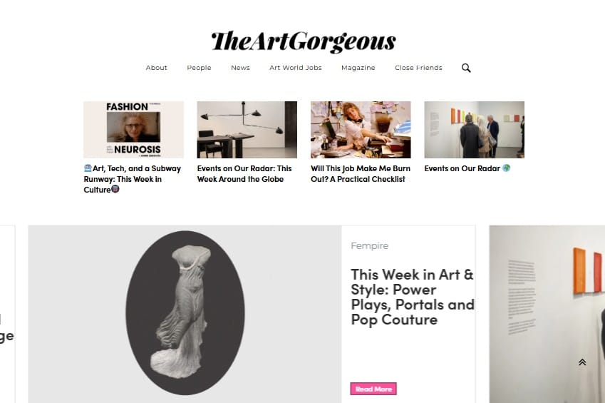
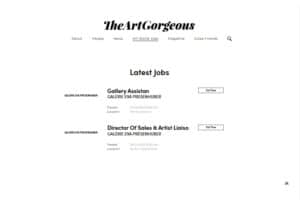
El rediseño se centró en cómo las personas se mueven a través del contenido.
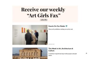
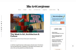
Se reorganizaron los artículos, categorías y artículos destacados para que los lectores pudieran orientarse rápidamente, comprender su situación y decidir qué leer a continuación sin problemas. Las decisiones visuales se basaron en la legibilidad y el ritmo, lo que permitió que el contenido se mantuviera entretenido sin distraer.
El trabajo pretendía respetar lo que ya hacía reconocible a TheArtGorgeous, a la vez que dotaba a la plataforma de una mayor estructura. El sitio debía ser actual, flexible y capaz de soportar colaboraciones continuas sin perder su personalidad.
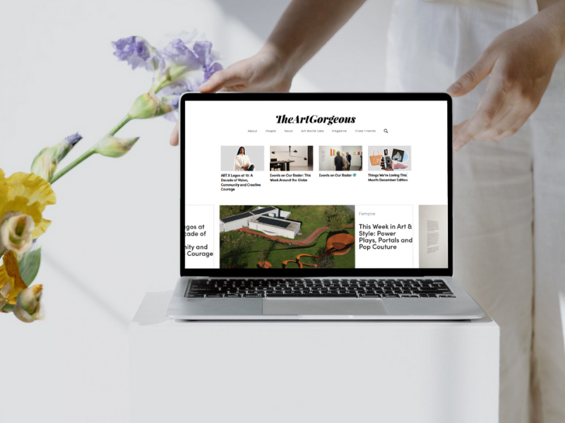
Resultado
El sitio web actualizado se alineó más de cerca con la forma en que la audiencia ya interactuaba con la marca.
Los lectores podían navegar entre artículos, reportajes y recursos con menos esfuerzo, y los colaboradores contaban con espacios más despejados para presentar colaboraciones sin interrumpir el flujo editorial. El tráfico de las redes sociales se tradujo en sesiones más largas, ya que los visitantes dedicaban más tiempo a leer en lugar de rebotar tras una sola página.
El sitio se convirtió en una base más sólida para todo lo que sucedía a su alrededor (contenido editorial, asociaciones y comunidad) en lugar de intentar competir con ellos.
Aprendizajes
Las plataformas mediáticas no se quedan quietas.
A medida que el público cambia su forma de llegar y de leer, los espacios que rodean el contenido deben adaptarse con discreción. Este proyecto fue un recordatorio de que un buen trabajo de rediseño a menudo pasa desapercibido, ya que permite que el contenido y la comunidad se mantengan en el centro.
Y en un espacio construido sobre la voz y la confianza, ahí es exactamente donde debe estar el foco.