Diseño Web y UX
Litio IoT
¿Alguna vez has comprado luces “inteligentes”… y luego has pasado diez minutos intentando hacer algo tan simple como atenuarlas?
Esa fricción fue el punto de partida para Litio IoT.
Sus sistemas de iluminación eran potentes: eficientes, adaptables, diseñados para casas y edificios reales. Sin embargo, la aplicación hacía demasiadas cosas a la vez. Funcionaba... pero no parecía fácil.
Servicios:
• Diseño de producto
• Rediseño de la interfaz
• Investigación de usuarios
• Prototipado
Industria:
• IoT
• Iluminación inteligente
• Eficiencia energética
El equipo:
• Gerente de producto
• Desarrolladores
• Diseñador visual
• Diseñador UX (yo)
Año:
2017
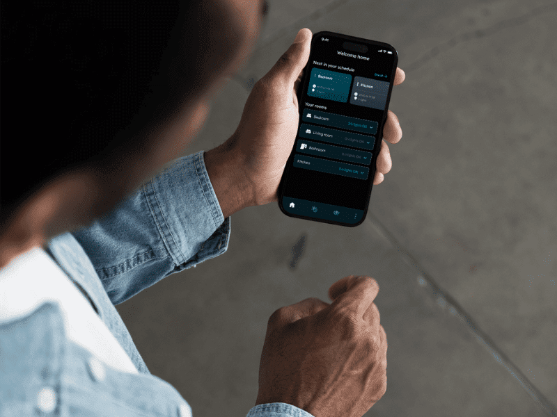
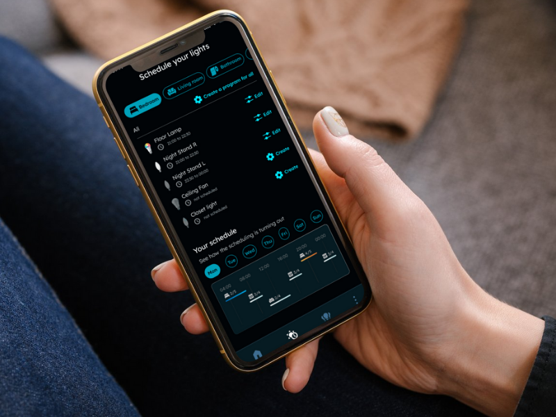
Qué es Litio IoT
Litio IoT crea sistemas de iluminación LED inteligentes que combinan eficiencia y automatización moderna. Sus usuarios van desde propietarios que crean ambientes para la vida diaria hasta profesionales que gestionan la iluminación de espacios más amplios. El producto se encuentra en la intersección entre comodidad, control y ahorro de energía, lo que significa que la experiencia debe ser práctica y confiable.
Descripción del proyecto
Cuando comenzó el rediseño, los usuarios se quedaron estancados.
La navegación parecía densa. La retroalimentación no era consistente. Las acciones simples requerían demasiados pasos. El resultado se reflejaba en los lugares donde las empresas lo perciben rápidamente: baja interacción y frecuentes solicitudes de soporte.
El objetivo era claro y medible: hacer que la aplicación fuera más fácil de usar, visualmente más limpia y brindar a los usuarios un mejor control sobre su iluminación, sin convertir la personalización en un rompecabezas.
Trabajamos con un cronograma de dos trimestres, con puntos de control regulares y decisiones tomadas rápidamente para mantener el alcance realista.
Alcance
El trabajo comenzó con la búsqueda de patrones en lo que los usuarios tenían dificultades y lo que intentaban lograr.
Tres grandes grupos de usuarios influyeron en las decisiones:
Personas que querían ahorrar energía mediante la automatización.
Personas que gestionan la iluminación en varias ubicaciones
Personas centradas en el estado de ánimo y la personalización.
A partir de ahí, el rediseño se centró en algunas cosas que eran más importantes:
Navegación más clara que no parece un laberinto de configuraciones
Escenas de iluminación fáciles de crear y ajustar.
mayor visibilidad del uso de energía, sin saturar la interfaz
El diseño y la construcción se desarrollaron en ciclos cortos con el gerente de producto y los desarrolladores, por lo que las decisiones se basaron en la viabilidad y los plazos. Las sincronizaciones semanales mantuvieron las prioridades definidas y evitaron caer en la categoría de "preferible".
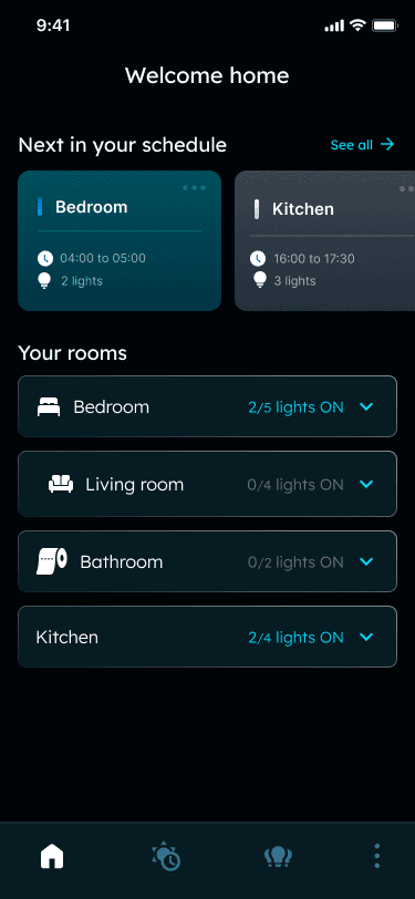
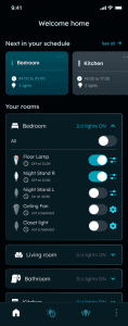
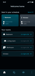


Resultado
La aplicación Litio rediseñada se presentó como un centro de control más tranquilo y predecible, que admitía acciones rápidas y una personalización más profunda sin que los usuarios tuvieran que esforzarse para lograrlo.
A los tres meses de su lanzamiento, la aplicación registró un aumento del 40% de los usuarios activos diarios y una reducción del 25% en tickets de soporte. Esas cifras importaban, pero el patrón detrás de ellas importaba aún más: la gente dedicaba menos tiempo a comprender la interfaz y más tiempo a usar el producto: crear escenas, gestionar dispositivos y ajustar la iluminación como parte de sus rutinas diarias.
El rediseño también proporcionó al equipo una base más sólida sobre la que construir. En lugar de añadir funciones a una estructura frágil, se pudieron incorporar nuevas capacidades sin afectar la experiencia.
Lo que este proyecto reforzó
Los productos inteligentes no ganan porque tienen más opciones.
Ganan cuando las opciones se sienten manejables.
Este proyecto fue un recordatorio de que lo "avanzado" no tiene por qué ser complicado, y que la manera más rápida de reducir la carga de soporte no es escribir más artículos de ayuda, sino eliminar los momentos que generan confusión.